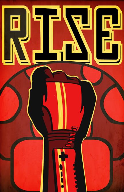
i love everything but the yellow outline of the glove, more hard edged and a little thicker, maby even whit bit's taken out so it looked aged/weartherd, it would give it a much more serious feel
looked at it, second glance there are a few other things but I'm not going to rant
I always like a faded, worn look to propaganda posters. A quick color manipulation yielded this:
Of course, with faded colors I would suggest doing some aging and weathering effects on the piece to give it a hand-printed, aged feel. You've got a little bit of it going on at the bottom corners of the poster, but the focal point of the poster is pristine. It makes the glove look like a separate piece, put over the poster, rather than a part of it.
I think strong red is in order, because the Soviet Russia propaganda posters I remember had striking colors. I don't like the yellow too much, maybe try white?
I felt like registering to comment on this piece. I think it would work better having the arm in a diagonal position. It simply fits better the idea of "power of the people" and would allow for a bit of perspective - a fist viewed straight from the backhand side looks a little nondescript, though I understand you have to see the Powerglove parts. Currently, the straight-up composition and image of pumping fists in the air is giving me much more of a fascist vibe, though you could also choose to go in that direction...
Yes, I feel that the fine line between fascism and communism is crucial....CRUCIAL on this Nintendo powerglove poster.
...I'm sorry I'm just making jokes, I appreciate the comment.
Ha. Nice. I like the yellow, but wouldn't mind seeing an outline in yellow.
Totally agree with the faded look. If you want to go for the old time communist photos, even with bright colors they still had an "old" faded look to them. Either way - good graphic, but what happened to the cord at the top of the glove. Looks like a piece faded into the shadowing.
Posts
looked at it, second glance there are a few other things but I'm not going to rant
Of course, with faded colors I would suggest doing some aging and weathering effects on the piece to give it a hand-printed, aged feel. You've got a little bit of it going on at the bottom corners of the poster, but the focal point of the poster is pristine. It makes the glove look like a separate piece, put over the poster, rather than a part of it.
Rock Band DLC | GW:OttW - arrcd | WLD - Thortar
I felt like registering to comment on this piece. I think it would work better having the arm in a diagonal position. It simply fits better the idea of "power of the people" and would allow for a bit of perspective - a fist viewed straight from the backhand side looks a little nondescript, though I understand you have to see the Powerglove parts. Currently, the straight-up composition and image of pumping fists in the air is giving me much more of a fascist vibe, though you could also choose to go in that direction...
Yes, I feel that the fine line between fascism and communism is crucial....CRUCIAL on this Nintendo powerglove poster.
...I'm sorry I'm just making jokes, I appreciate the comment.
Totally agree with the faded look. If you want to go for the old time communist photos, even with bright colors they still had an "old" faded look to them. Either way - good graphic, but what happened to the cord at the top of the glove. Looks like a piece faded into the shadowing.