The new forums will be named Coin Return (based on the most recent vote)! You can check on the status and timeline of the transition to the new forums here.
The Guiding Principles and New Rules document is now in effect.
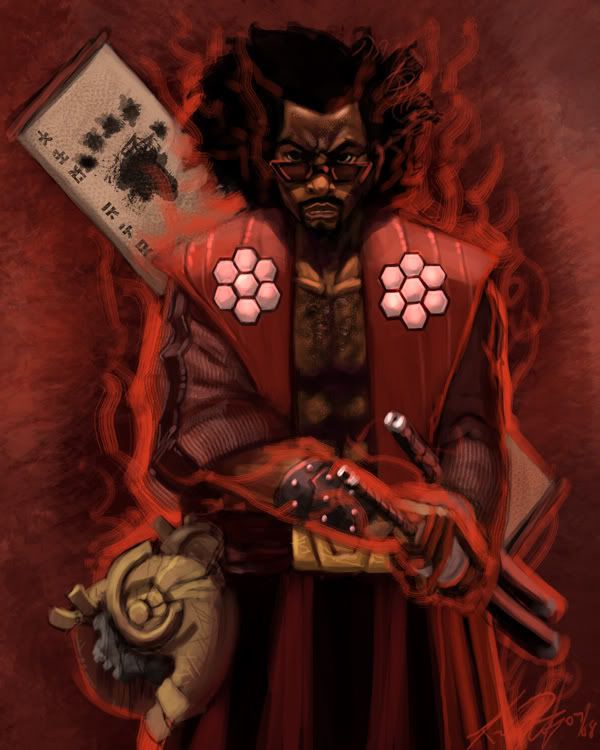
Katana are usually sheathed edge up. Not sure how realistic you were going with that so, it may or may not be a crit. Or it could be a Tachi, which would be blade down; but those are usually hung from the belt, and not thrust threw it.
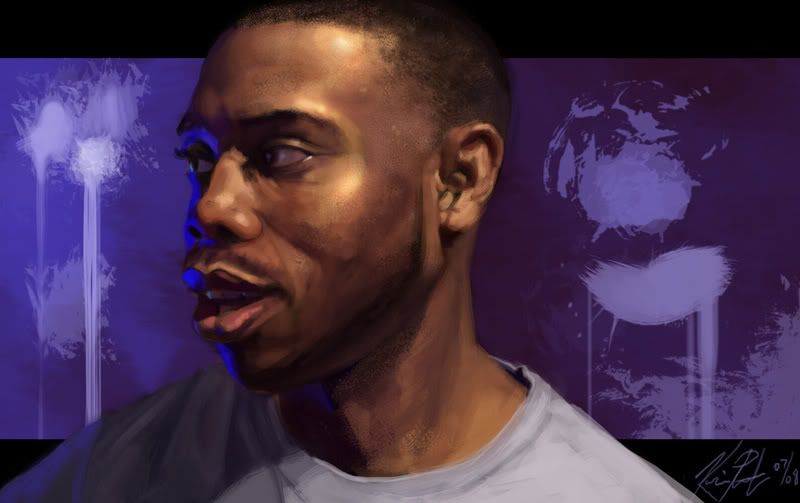
-edit- ps. really love the last 2. The last one in particular. Wish I could offer a more constructive crit than that.
Kunkoh on
0
MustangArbiter of Unpopular OpinionsRegistered Userregular
edited July 2008
Beautiful stuff man, really nice.
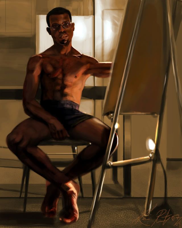
The third piece is my favourite but those feet are really bothering me, particularly the heel on the right (the charachters (which I guess is your) right) leg.....yeah I think I just confused myself.....the foot on the right of screen.
The face in the second one is so niiccee.
I'm not really sure what's going on with the spots in your style though, like, what it's trying to suggest. Like, highlights or, something? I was sorta thinking like.. freckles, or maybe body hair, but. I can't really tell. Especially on the ankle, my first reaction was like, razor burn. The values in the lightness and darkness in the self portrait are really nice too.
Self-portraits are really good. I feel on the other two, though, that your texture brush is reeeeeeally distracting. Specifically, the one you seemed to use for the majority of the pieces - the "scratchy lines" one. Outlining the figures with it isn't working, mostly on the samurai guy. I had to stare at his forearm for awhile before I could tell what was going on, but it's still a bit hard to discern.
I agree with ND on the textures. I enjoy the self portraits though I find the hand placement of the hand in the first one curious. I have to say, I feel like you have steadily gotten better as you gain control of your urge to over texture.
Anyone who has not heard of or seen these movies, do so immediately, it's hysterical.
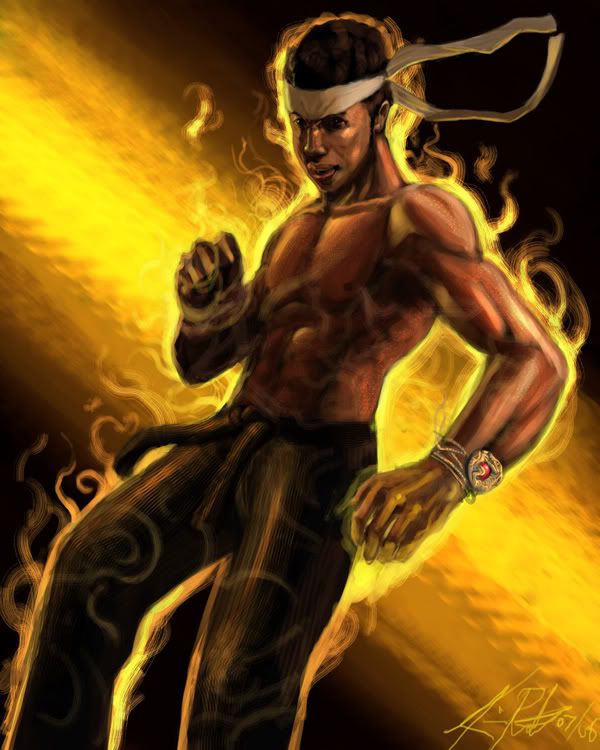
also, a quick overview. BTW the glowing outline around them has to stay, because that is an integral part of The Last Dragon's mythos.
I saw this so long ago, that I didn't even realize that's what you were drawing; till Zach mentioned it. Then it was a "oh shit! It's the glowy dudes!" Then I understood why you gave them the outline you did.
It looks like you have a boner in the first pic because of the shadowy area, but I like the second drawing. I think the fuzzyness of the brushes is kind of hurting your work.
really like the self portraits. the last one you posted (b&w one) is great, something as simple as the reflection in the glasses shows so much detail. keep going. would love to see you do something in acrylic or oils.
Well you'll have to settle for red lines in the mean time. I've still got 95 to go, I'm sure I'll get at least 2 acryllics in there. I got all this masonite board lying around not doing much.
The last self portrait in the OP is great, but in the first one are you intentionally doing less detail in the lower part of the picture, or were you getting bored?
Indica1 on
If the president had any real power, he'd be able to live wherever the fuck he wanted.
Agreed, very much liking to these newest two, the last one especially has very nice color and I like the softness. A few things: What is causing his pancho to bend inward at the waist? If there is some internal band cinching it, I would think it would create some folds in the cloth horizontally. The guys face also looks a little off, I think it's the mouth, maybe I'm just wierd, as well though the mask looks like some kind of metal. Was this intended? In the first one, the lions eye closest to the blade looks really droopy; I think it's the vertical highlighted line. And I like how you handled the mane in the second one better, the texturing in the first one doesn't come off right, to me at least. That's all I could find to nag about.
Really nice stuff man. I love the last blue self portrait and the more recent fantasy stuff. I can't really crit much besides that I find the first 2 to be a bit blurry.
Very good. I especially like the second and the fourth. The only real critique that I have would be the character's left forearm in your first picture. It appears to be too thick towards the lower part.
The guy in the foreground is blending in a bit, value0wise, with the beasties. You could probably push the contrast in the overall picture more, especially in the flame-bits. More saturation + brightness.
I was gonna reply to Scalfin's 'crit' when I noticed he was banned, which leads me to think he was a cad, and has no idea what he's talking about. Anyway, 'nudder one.
I like these last few fantasy ones, and the second self portrait in OP (although it seems like it might be less true to your face based on the 3 other ones.. could just be the glasses though). The last couple really make me think MTG, like Jamuura meets clockwork enemies.
I really like the energy and perspective of this one, but it still looks a little too out of focus for my taste.
The guys shoes look really sharp and clean, but then you look at the scarf and his arms and they look really blurry.
I'd kinda like to see it with the contrast bumped up just for curiosity sake. The design of the robot is really cool and the birds give the image a good sense of height.
Posts
-edit- ps. really love the last 2. The last one in particular. Wish I could offer a more constructive crit than that.
The third piece is my favourite but those feet are really bothering me, particularly the heel on the right (the charachters (which I guess is your) right) leg.....yeah I think I just confused myself.....the foot on the right of screen.
I'm not really sure what's going on with the spots in your style though, like, what it's trying to suggest. Like, highlights or, something? I was sorta thinking like.. freckles, or maybe body hair, but. I can't really tell. Especially on the ankle, my first reaction was like, razor burn. The values in the lightness and darkness in the self portrait are really nice too.
The last two are super nice, though. Seriously.
Also, Last Dragon fanart is fucking awesome. There is nowhere near enough of it.
also, a quick overview. BTW the glowing outline around them has to stay, because that is an integral part of The Last Dragon's mythos.
Behold.
www.wonderingart.com
Pie.
The last self portrait in the OP is great, but in the first one are you intentionally doing less detail in the lower part of the picture, or were you getting bored?
If the president had any real power, he'd be able to live wherever the fuck he wanted.
not-self-portrait:
70% resolution
:^: from D&D
Only crit I've got is that the legs on the first one are a little too far apart or too skinny and the cape seems kinda stiff.
But seriously, :^:.
botp
Flickr | Facebook | Classifieds | GigPosters | Twitter | Blog
Again, great stuff!
INSTAGRAM
What stands out most to me is the fourth picture you've posted. The colors and forms are vibrant and well developed.
Bravo.
now I'm off to work.
Oi! Maybe I will!
INSTAGRAM
Edit: Sorry about how harsh that sounds. I got this one confused with a "crit my work" thread.
The guys shoes look really sharp and clean, but then you look at the scarf and his arms and they look really blurry.
I'd kinda like to see it with the contrast bumped up just for curiosity sake. The design of the robot is really cool and the birds give the image a good sense of height.
INSTAGRAM