The new forums will be named Coin Return (based on the most recent vote)! You can check on the status and timeline of the transition to the new forums here.
The Guiding Principles and New Rules document is now in effect.
Beast Rider Update p.2 [Dump] NSFW, 56k
Tam Registered User regular
 Registered User regular
Wherein I attempt to turn over a new leaf.
OK, so I am doing one finished sketch per day. Hopefully, I will eventually be able to gather the patience and focus to move on to regular finished pieces, but baby steps.
Please feel free to crit as you will. However, I WOULD PREFER crits on long-term goals and habits. What do you see that I could be doing better? What sorts of habits have helped you work through artistic obstacles? Which habits are apparent in my work that you think I should break?
I feel a bit lost on where I'm going because school is another path entirely, so I am trying to get a general sense of direction from averaging all you fine folkses' input.
Here are recent things:
This is a naked torso of a girl (pencil)
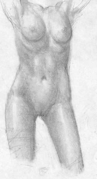
CM and Mars might be happy to know that I will finish this somehow or another even if it takes me forever and a day.
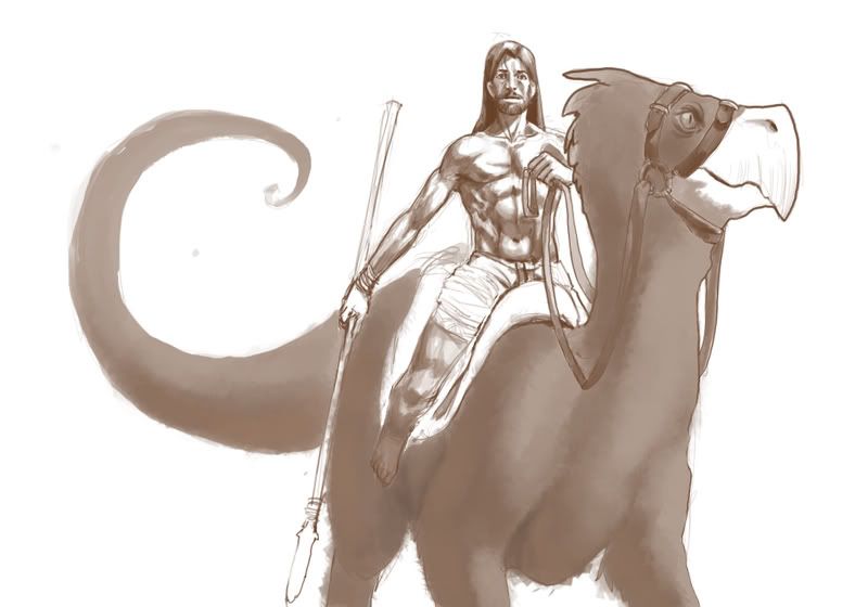
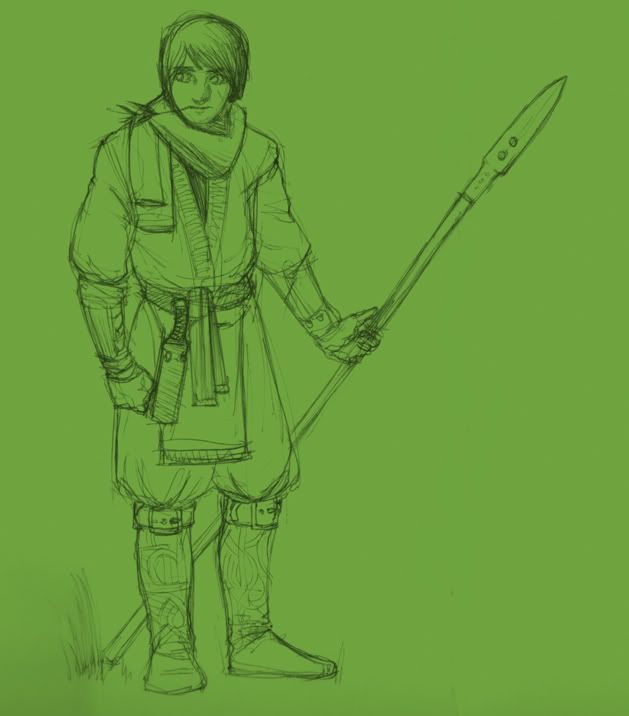
This is a scout sort of character (ballpoint)
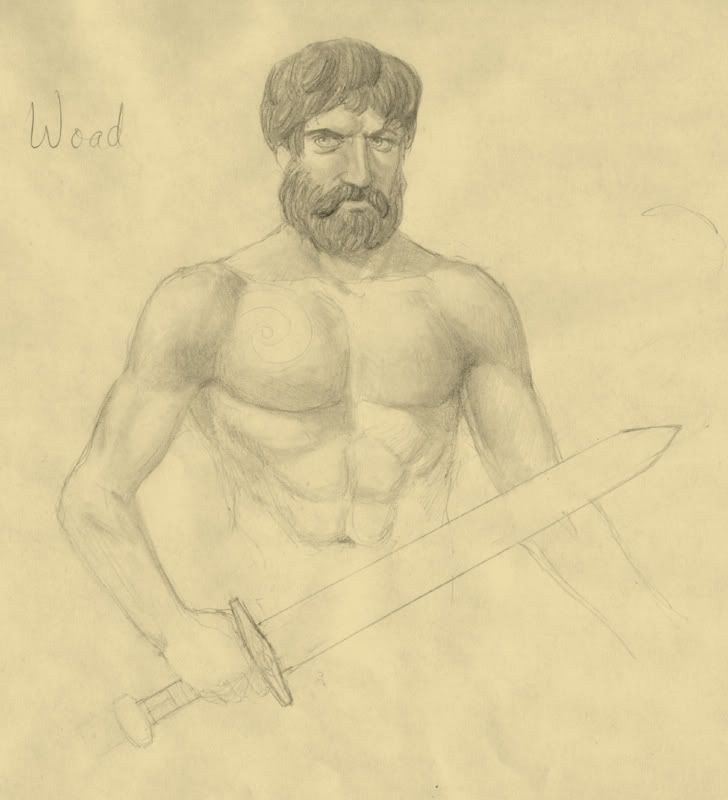
A stern fellow with a sword (pencil)
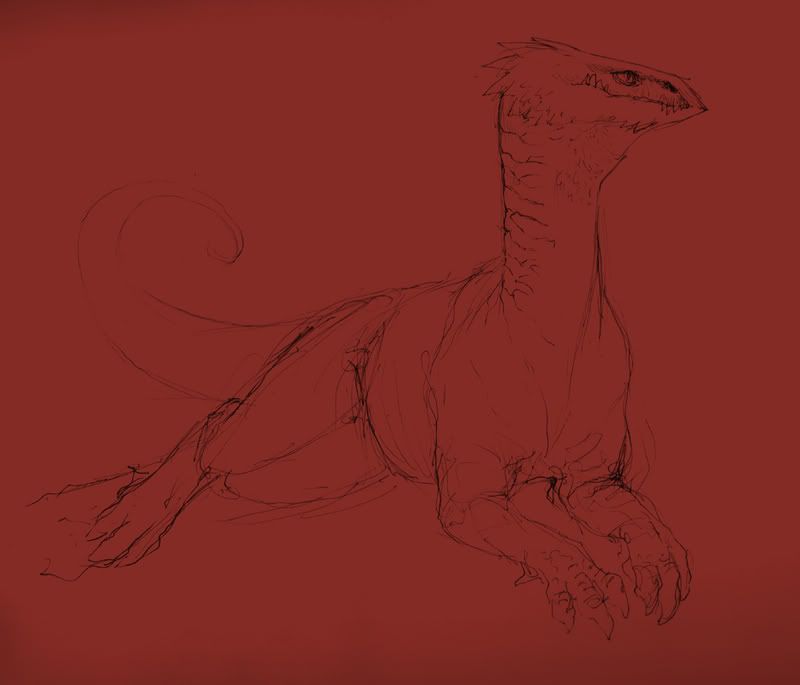
A dragon lounging about after a long day killing pompous windbags wielding lances (ballpoint)
On good faith, I have here two finished sketches
A golem and a brutish orc are fighting. The orc smashes the golem's body to bits. At the same time, the golem decapitates the orc. A very able and creative Necromancer happens upon the scene and melds them together (ballpoint)

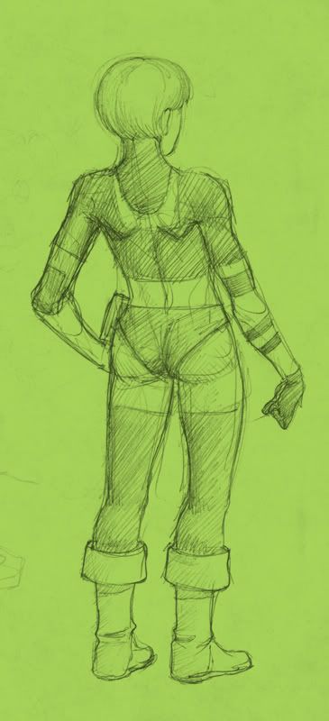
A female superhero drawn from the back. As far as powers, think Hancock, but she can't fly...also she is not an asshole (ballpoint)
OK, so I am doing one finished sketch per day. Hopefully, I will eventually be able to gather the patience and focus to move on to regular finished pieces, but baby steps.
Please feel free to crit as you will. However, I WOULD PREFER crits on long-term goals and habits. What do you see that I could be doing better? What sorts of habits have helped you work through artistic obstacles? Which habits are apparent in my work that you think I should break?
I feel a bit lost on where I'm going because school is another path entirely, so I am trying to get a general sense of direction from averaging all you fine folkses' input.
Here are recent things:
This is a naked torso of a girl (pencil)

CM and Mars might be happy to know that I will finish this somehow or another even if it takes me forever and a day.

This is a scout sort of character (ballpoint)

A stern fellow with a sword (pencil)

A dragon lounging about after a long day killing pompous windbags wielding lances (ballpoint)

On good faith, I have here two finished sketches
A golem and a brutish orc are fighting. The orc smashes the golem's body to bits. At the same time, the golem decapitates the orc. A very able and creative Necromancer happens upon the scene and melds them together (ballpoint)

A female superhero drawn from the back. As far as powers, think Hancock, but she can't fly...also she is not an asshole (ballpoint)

Tam on
0
Posts
Actually these are neat, and I was afraid to disobey your orders to come post in your thread.
Nude woman - Her right breast appears high; or left appears low. Both arms are raised (but off the page) so it's hard for me to tell if one shoulder is higher than the other; which would raise that particular breast. I'm assuming this is from a reference, so maybe her body is like this; but it looks like her hip comes almost all the way up to her lower ribs; particularly on her left side. Something with the whole left leg, hip are just doesn't jive for me. Can't quite put my finger on it though.
The dragon/bird thing rider guy's legs go strait down, then appear to go back. I think this is a bit wrong for how we normally sit on a riding animal (horse for reference). Leg usually comes forward maybe 45 degrees or so; and then go nearly strait down from the knee.
Also, even without the stirrups, so the feet would hang down; they wouldn't quite hang down that much.
ALSO, note the knees go OUT, not in like you have in the revised edition.
edit (like 3 I think)
I actually preferred the original spear pose. It looked like he pulled up in a bit of surprise, so his body would be tense, and a bit ridged. Not as if he had been riding like that. So that pose/hand position made sense to me. I can't think of why in that situation you would pull your lower legs back though o.O?
I'm considering most of your points, but dimension references don't really work here. It's not a horse, and doesn't have the same proportions.
When I make feathers I actually go through and rough them individually It takes more work but you'll enjoy the result, I think. I think drawing a light tip and then going through and defining the shadows help. Also why so low contrast?
I fear contrast because I feel like I never do it right, Iruka.
You only colored a couple feathers and already I love how you decided to render the feathers. One thing though: I'd change the color of the background from blinding white to somewhere around 25-50 % gray. The reason is because as time progresses and you are painting the subjects against a white background, your eyes will not only get sore but they start to judge the spectrum of values you wanted against this background. And that means the painting/colouring decisions you make will start to be affected. Believe me, I used to go ahead and paint on a stark white background for character designs and what not, and then I look at it later and cry how the key of the painting isn't what I meant it to be.
But then this may be personal preference. Does this apply everywhere? No, alot of entertainment design work is done on utter white canvas and that's okay. But how the value and color of the background will affect your painting decisions on things in the foreground and overall key of the painting is something to think about.
With the subject itself, the man is drawn and rendered very nicely, except that right hand is wonky. I'd make the bird beast's metatarsal cannon (lower right hind leg) and his foreleg shift to the left a little and its paw turned a little more to the left. The tail is out of perspective of the creature, or else that base of the tail must be really prehensile, but prehensility is usually observed at the last half of the tail; not right off the base of the spine.
From looking at all the art in this thread, your figures both animal and human are in some pretty stiff poses with little life. I looked at each piece and I see no instances of contrapposto--your female hero in ballpoint is an excellent example where you could have pushed the pose but oddly we must have caught her in that rare instance where she equally distributed her weight evenly between her feet. Her gluteal band (the lower bottom of the buttocks) is horizontal too. Something tells me you don't go to life drawing class often or you weren't paying attention to how the model distributes their weight. This is something you should look into.
And no, I sadly don't get to take life drawing classes and haven't done much of it on my own.
note, I read your post after getting to this point, so don't think I'm not taking your tips, Mudkachu.
I'm loving the bronze green/mud color palette you're using for the bird beast, so much in fact I'm going to yoink that color palette if you don't mind.
and it's because you use a lot of dark lines for bold details and shadows on the guy while you seem to be kind of wary of doing that to the bird
What sucks is that I lost the PSD a long time ago, so I have to do all this on one layer. Well, 5 hours to work, let's see what I can do.
mudkachu: yoink away, sir.
I look forward to how you finish the drawing.
I converted the pic to grayscale to give you an idea how narrow the value ranges are. On the feathered monster, you were only using about a QUARTER (.5-.75 black) of the black to white value spectrum, which is why it looks so flat and clay-like compared to the rider.
I did a super rough paintover to show you how it might look with a wider value variance. That means not only going darker but giving your highlights more power as well. Don't be afraid to use the silhouette shape to help describe the texture of the feathers as well. This obviously isn't the only or best way to handle this problem, just how I would do it.
I should also add something I didn't address in my PO, that the way you've done the extremely sharp light to dark shifts on the rendering of the rider give him a very oiled up or almost metallic sheen. His skin needs to be handled a little more delicately.
As previously mentioned, you've got some stiff poses going on here- and even though you've got a bit of action in the newest one, it still has the same stiff, straight vertical line of action that the other ones have. It feels like, as you mentioned you've had little life drawing experience, you're getting locked up into getting the anatomy so correct, that you may be subconsciously reproducing the sort of anatomical diagrams you get from an anatomy book- straight on, little or no perspective, standing up straight. The good thing is I'm not going to say the anatomy is necessarily inaccurate, but the bad thing is that it's, well, boring- which is almost even worse in my mind.
What I might suggest is checking out a book called Force, which focuses entirely on how to create a sense of weight and purpose to a pose.
First thing is the lack of perspective. Well, there's perspective, but it's so shallow that it flattens the figure out, like the guy is being shot with a telephoto zoom lens from 100 yards away. This has its uses, but you shouldn't let it become a habit, as you'd be throwing a huge tool for dynamic composition out the window.
Second thing, is lack of overlapping forms. Take a look at the monster guy here. It's got all the muscles and junk in there, but while you've punched out a really bold, sharp line on the outer edges, you don't emphasize the overlap of the internal forms nearly as much, instead opting for a light line with some fuzzy shading around it. The junction of the muscles at the elbow in particular demonstrates what I'm talking about- yeah, you show how one of the muscles from the forearm overlaps the end tip of the bicep, but you're kinda pussied out on emphasizing it to create a sense of volume. Or the quads on the legs- you've got the quads in there, but you let them get run over by that harsh outer outline, rather than letting them break that contour to get some foreshortening going on.
If you look at some master drawings, particularly those by Rubens, you can see how they built form over form with overlaps to create weight and depth. In many cases these aren't things that somebody might actually see if they looked at a model taking the pose, but were consciously brought out and emphasized for the explicit purpose of creating an added sense of mass. Your drawings, on the other hand, are very much about emphasizing the external contour, creating a figure through silhouette, and then adding details in later. Look at the monster guy's torso- yeah there are all these muscles and abs and junk in there, but what are those details actually serving to accomplish in terms of mass?
Now, I've done a quick take on monster guy here, and I'm sure if I paid more attention I could have been more accurate but whatever that's not the point. What I've done is throw in some perspective (granted, exaggerated), and made sure the forms are all give big, massy overlaps. The pecs overlap the head a bit, the man-batch overlaps the inner thigh, the gut overlaps the leg and the arm behind it, etc etc. It may not be accurate, it may not have every muscle detailed out, hell it may not even be very good, but what it does have is weight- the sense that this dude could right now start walking around the page and doing whatever sort of angry motherfuckery things he does.
Now in the chat thread I brought up that I felt the naked girl torso was definitely the weakest one, and it's for the same reasons I've been explaining. I get the feeling this was probably done from photoref, or at least was trying to come across like it had been. Now, this is the problem with photoref, is that you can start in on it and feel like everything has been done for you; just duplicate what's there, and you're done, right? But to work successfully, a photorefed piece has to be given the same amount of thought and analysis as one you'd do from life or from imagination: Where is the weight? How can I bring out the pose? What are the major masses? Where are the light sources? Only then will you be able to nail in your piece what was actually interesting about the actual photo, and also it's the only way you're going to derive and really long-term benefit from copying photos.
Which of these 2 describes the basic idea of the pose better? The one that describes the outline, or the one that describe the weight?
Twitter
I think I get it. I'm trying to process yours, Scosglen's, and Mudkachu's advice. I will post something of what I think I learned tomorrow. EDIT: or maybe tuesday; fucking work.
Here is something I did between orders at work:
Greater range of values, yes? Probably something very wrong with it.
Whoo, I'm glad I made this thread- what a wake up call.
Don't let cantankerous bearded deli meat bring you down, anyone who knows anything knows that they know nothing.
It's definitely a good start, but you still have a straight-on symmetrical torso that's stiffening it up. Symmetrical poses are not your friend.
Look at the action and the weight: the mass of torso is being held up in part by the arm on the left touching the ground. Gravity is pushing the torso down- therefore, you're going to get that side of the torso being propped up by that arm, while the other side is going to be pushed down lower by gravity. And on the other arm, he's grabbing forward- with no force to oppose the action, this is going to twist that side of the torso further forward in space. The whole body is involved in the action, not just individual limbs.
Then, gravity and the guy's action are going to twist the pelvis in the directions opposite those forces in order to create balance, and maintain control of his body upon landing.
tried to illustrate the point via sharpie marker, not sure if I succeeded or just made the idea even more confusing because of all the mistakes.
Twitter
Tried something that actually has an environment.
I'm working on the rider. update later today.
neat stuff indeed
Mo' contrast, but is it enough?
from jagged alliance
the bird-thing still feels flat, but I think once it is detailed more it should help.