The new forums will be named Coin Return (based on the most recent vote)! You can check on the status and timeline of the transition to the new forums here.
The Guiding Principles and New Rules document is now in effect.
Wait, so what exactly are you developing? A game? A story?
It's all pretty effin awesome. I honestly didn't know how good you were with "serious" drawings like these. I've only seen your carrots and cartoons.
srsizzy on
BRO LET ME GET REAL WITH YOU AND SAY THAT MY FINGERS ARE PREPPED AND HOT LIKE THE SURFACE OF THE SUN TO BRING RADICAL BEATS SO SMOOTH THE SHIT WILL BE MEDICINAL-GRADE TRIPNASTY MAKING ALL BRAINWAVES ROLL ON THE SURFACE OF A BALLS-FEISTY NEURAL RAINBOW CRACKA-LACKIN' YOUR PERCEPTION OF THE HERE-NOW SPACE-TIME SITUATION THAT ALL OF LIFE BE JAMMED UP IN THROUGH THE UNIVERSAL FLOW BEATS
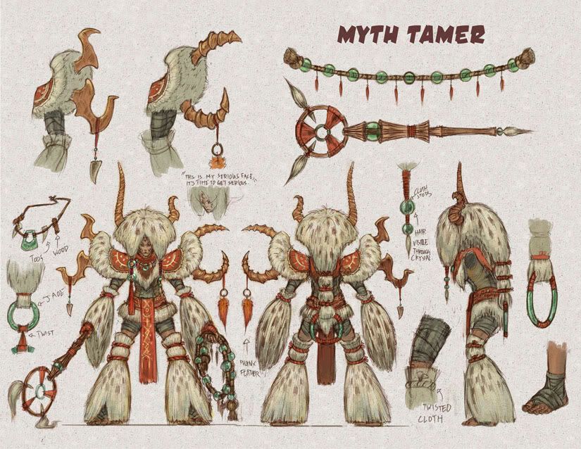
Wow, totally awesome. Yeah I was kind of wondering what it was for also, because the only thing I can see (since these appear to be character designs which would imply you would be drawing them a lot) is detail gonna be an issue? I mean the Myth Tamer has A LOT of intricate detail work I imagine would take forever to reproduce.
JohnTWM on
0
BuckwolfeStarts With Them, Ends With UsRegistered Userregular
edited October 2008
Wow. You can consider me pretty much floored by this display. I'd love to go and knit pick if I find anything, or have the time later. As of right now I'm a little too taken aback. I'd honestly forgotten just how fucking capable you are.
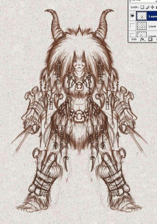
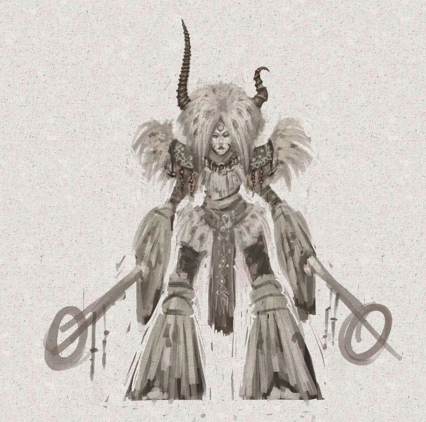
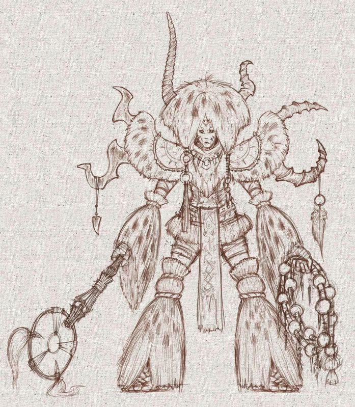
Just a thought, but have you tried reversing the horns on it's head? here is a quick edit to your original image to show what it would look like. vs.
I think it gives a better over all balance to the figure, but you might disagree.
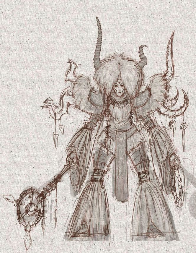
John: I just copy and paste the lineart into the texture file as a based to paint over. Not as complicated as you think. Also I feel like the way I had it has better balance. The composition makes you look over the face, instead of going down one side.
Buckwolfe: Thanks verymuch! I look forward to crits. Also i may change the fuzzy sleaves to pleated kimono stuff. The hair is not too interesting to me right now.
MustangArbiter of Unpopular OpinionsRegistered Userregular
edited October 2008
Awesome drawing Prox but I'm kinda feeling that there's just a touch too much shit going on with it.Like a lot of the bells and whistles could be removed to make it a bit cleaner.
eg.
Spoilered for nasty clone stamping.
Anyway just my two cents.
Mustang on
0
BuckwolfeStarts With Them, Ends With UsRegistered Userregular
Buckwolfe: Also i may change the fuzzy sleaves to pleated kimono stuff. The hair is not too interesting to me right now.
I'm all for experimentation, but I can't help feeling that a pleated sleeve would only flatten out the image, and run the risk of making the overall design that much less inspired. That's not to say that you shouldn't give it a shot. By all means, please do so, but I personally can't see it being more interesting than what you already have going. Could be wrong though. Even so I am 100% in favor of a hair, or hair-like material. If you're not that keen on hair, then try a substitute. Like straw, or something of that ilk.
I think that the problem (if there is one to speak of) that you might have with the hair, is that the way you're drawing it. It almost looks like cloth to me, instead of...well....not cloth. I love the idea of hair themed apparel, but it doesn't look like its acting like hair would. Hair tends to sort of...bunch? Clump? In any case, it doesn't have the same physics as a sheet of cloth does.
John: I'm also not completely sure if I agree with your idea. I keep staring at the two side-by-side, and find myself more drawn to Prox's original. It has a much nicer flow to it. If you just follow the flow of the tip of each extremity to the opposing one, it has a much smoother flow, or transition.
Mustang: Not to be overly negative, but I'm very keen on the overt bells and whistles. I can see where you're coming from though. It might not be that there's too much, but that it doesn't feel completely unified. With no disrespect to Prox, or his fantastic art, the drawing in general feels unpolished. Its on the right fucking track and all, but I think it might be missing that last vital step to really bring it full circle.
I suck at conveying ideas sometimes. This might be one of them.
Being a tribal-inspired design, extravagent charms and skulls and things like that really add to it.
Zombiemambo on
0
MustangArbiter of Unpopular OpinionsRegistered Userregular
edited October 2008
Yeah I did take that into account...but I dunno, it still looks overdone to me.
Like doorways would be an insurmountable task, "Oh fuck the mythtamer is coming! Call the builders! We need double doorways on these huts poste haste or there's going to be a shitstorm heading ourway!"
Mustang on
0
BuckwolfeStarts With Them, Ends With UsRegistered Userregular
edited October 2008
I guess I could see how that might be valid, if it were the case. However, I'm just not seeing it, Mustang. As far as I'm concerned, it could even stand to have more, if it were treated carefully. It doesn't necessarily need more though. As it stands I think that its not only perfectly adequate, but accurate.
I think it's fine, actually...the only thing that I would change are the sleeves, or the lower-half of the "pants". I feel like if either one were less "voluminous", it would fix whatever problem there seems to be with it looking over-complex. There are just so many large forms and shapes like that, I think making one of those two thinner or something would make it look a bit better.
It seems like people generally like the big foofy guy, so I realize I'm gonna be the outlier here, but I really have to say that the design is just not jiving with me.
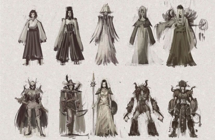
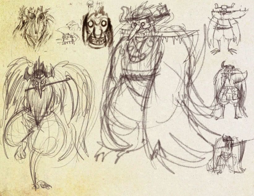
It's difficult to articulate exactly why I don't like it, so forgive me if this is clear as mud. The costume just seems too flamboyant and, well, "foofy". It's like a cross between a K.I.S.S. and a Cher costume with a shaman flavor. Something about the rhythm of the shapes makes it seem almost puppet-like. Maybe if we could see him in a pose moving around or gesturing a bit more naturally like most of the original silhouette thumbnails it might change my mind.
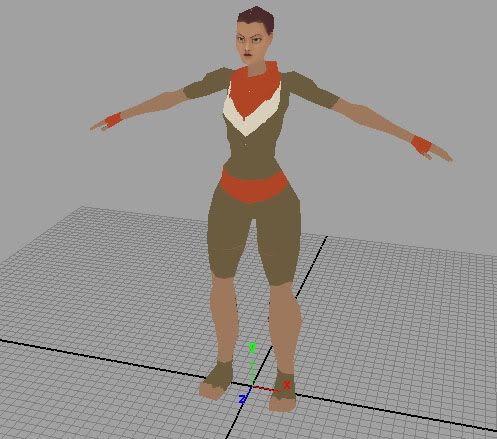
It's been an interesting experience trying to wrap my head around texturing. 8-)
This one character has taught me a lot about making video game assets. In texture painting specifically, there is a lot of back and forth between maya and photoshop, doing a lot of testing to see if things work out on the model.
Your legs are wrong: right now, you've drawn them as if they angle out from the hip, and then go straight down. In fact, your hip joint is actually in line with the center line of your leg and knee.
Posts
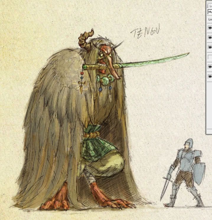
Value range, tribal concepts, tengu- you couldn't give me much better.
INSTAGRAM
that's his face. he's a giant mythical bird man spirit monster that haunts forests.
artistjeffc.tumblr.com http://www.etsy.com/shop/artistjeffc
I've said it before, but I'll say it again......I love those sketches.
I'm giving it everything.
artistjeffc.tumblr.com http://www.etsy.com/shop/artistjeffc
It's all pretty effin awesome. I honestly didn't know how good you were with "serious" drawings like these. I've only seen your carrots and cartoons.
love Tengu!
Terrible!
wait
Steam handle: Buckwolfe
vs.
I think it gives a better over all balance to the figure, but you might disagree.
Buckwolfe: Thanks verymuch! I look forward to crits. Also i may change the fuzzy sleaves to pleated kimono stuff. The hair is not too interesting to me right now.
Beavo: Thanks Ms. Tron!
artistjeffc.tumblr.com http://www.etsy.com/shop/artistjeffc
eg.
Spoilered for nasty clone stamping.
Anyway just my two cents.
I'm all for experimentation, but I can't help feeling that a pleated sleeve would only flatten out the image, and run the risk of making the overall design that much less inspired. That's not to say that you shouldn't give it a shot. By all means, please do so, but I personally can't see it being more interesting than what you already have going. Could be wrong though. Even so I am 100% in favor of a hair, or hair-like material. If you're not that keen on hair, then try a substitute. Like straw, or something of that ilk.
I think that the problem (if there is one to speak of) that you might have with the hair, is that the way you're drawing it. It almost looks like cloth to me, instead of...well....not cloth. I love the idea of hair themed apparel, but it doesn't look like its acting like hair would. Hair tends to sort of...bunch? Clump? In any case, it doesn't have the same physics as a sheet of cloth does.
John: I'm also not completely sure if I agree with your idea. I keep staring at the two side-by-side, and find myself more drawn to Prox's original. It has a much nicer flow to it. If you just follow the flow of the tip of each extremity to the opposing one, it has a much smoother flow, or transition.
Mustang: Not to be overly negative, but I'm very keen on the overt bells and whistles. I can see where you're coming from though. It might not be that there's too much, but that it doesn't feel completely unified. With no disrespect to Prox, or his fantastic art, the drawing in general feels unpolished. Its on the right fucking track and all, but I think it might be missing that last vital step to really bring it full circle.
I suck at conveying ideas sometimes. This might be one of them.
Steam handle: Buckwolfe
Like doorways would be an insurmountable task, "Oh fuck the mythtamer is coming! Call the builders! We need double doorways on these huts poste haste or there's going to be a shitstorm heading ourway!"
Steam handle: Buckwolfe
It's difficult to articulate exactly why I don't like it, so forgive me if this is clear as mud. The costume just seems too flamboyant and, well, "foofy". It's like a cross between a K.I.S.S. and a Cher costume with a shaman flavor. Something about the rhythm of the shapes makes it seem almost puppet-like. Maybe if we could see him in a pose moving around or gesturing a bit more naturally like most of the original silhouette thumbnails it might change my mind.
I think scos was talking about the Myth Tamer, not Tengu, but I could be wrong.
artistjeffc.tumblr.com http://www.etsy.com/shop/artistjeffc
To save time, i've decided to forgo texturing the muscles of the legs, and went straight to the sleeves.
artistjeffc.tumblr.com http://www.etsy.com/shop/artistjeffc
Flickr | Facebook | Classifieds | GigPosters | Twitter | Blog
progress
artistjeffc.tumblr.com http://www.etsy.com/shop/artistjeffc
It's been an interesting experience trying to wrap my head around texturing. 8-)
This one character has taught me a lot about making video game assets. In texture painting specifically, there is a lot of back and forth between maya and photoshop, doing a lot of testing to see if things work out on the model.
artistjeffc.tumblr.com http://www.etsy.com/shop/artistjeffc
>.<
Prox, I love'a this'a stuff. Almost as much as I a love'a some meat'ah balls.
My Portfolio Site
edit no wait: Her feet are spread at an angle...i dont understand your critique.
okay now i get it. Her feet are spread apart. if her knees were together, then it would line up with the pelvis.
artistjeffc.tumblr.com http://www.etsy.com/shop/artistjeffc
Hmm, I did make the upper leg too short, which i corrected in my model. I needed to indicated more foreshortening.
artistjeffc.tumblr.com http://www.etsy.com/shop/artistjeffc