The new forums will be named Coin Return (based on the most recent vote)! You can check on the status and timeline of the transition to the new forums here.
The Guiding Principles and New Rules document is now in effect.
Um.. hes not drawing the heads to big. Its a little difficult to get all anal about the canon of proportions when your dealing with cartoons...
Hes actually got a pretty solid grasp of anatomy albeit very cartoony.. A little to focused on style maybe..
Kendeathwalker on
0
MustangArbiter of Unpopular OpinionsRegistered Userregular
edited August 2009
Hes actually got a pretty solid grasp of anatomy albeit very cartoony.. A little to focused on style maybe..
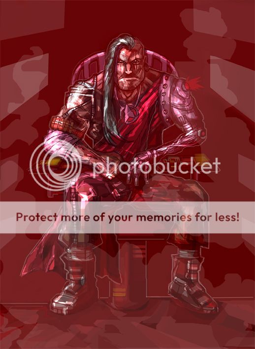
I'm going to have to disagree, I think there are a lot of anatomical and structural flaws through out these. The second one is the strongest, but there are still a few confusing shapes that don't make sense.
Personally I'd recommend you step back from the stylised stuff and focus on more traditional figure drawing and construction. Sounds boring but it'll make this stuff all the more stronger when you come back to it.
The painting of these pieces are what's killing it. Too much Photoshop, it's a shame too cause looking at the lineart, it's not bad. I liked the Batman piece and android piece too. When it comes to filters and custom brushes in Photoshop, less is more. Don't be discouraged though, lotta potential here
t i m on
God put me on this earth to accomplish a certain number of things. Right now I am so far behind that I will never die.†Bill Watterson
0
MetalbourneInside a cluster b personalityRegistered Userregular
edited August 2009
My main gripe comes you outlining everything in white. The first picture is especially bad, because it looks like a cartoon sealed in a blister pack.
Hes actually got a pretty solid grasp of anatomy albeit very cartoony.. A little to focused on style maybe..
I'm going to have to disagree, I think there are a lot of anatomical and structural flaws through out these. The second one is the strongest, but there are still a few confusing shapes that don't make sense.
Personally I'd recommend you step back from the stylised stuff and focus on more traditional figure drawing and construction. Sounds boring but it'll make this stuff all the more stronger when you come back to it.
I didnt say he understood structure or form. Just anatomy.. in the 2d sense of knowing what muscles insert and where the bones are kinda suppoused to be.
Ill have to join the crowd saying these would be much easier on the eyes as just linework. Going a little nuts with your photoshop
Not bad. Just need to refine them further to a more finished state. Like T I M said, too much photoshop.
I agree with Metalbourne about the white outlines. In that first picture, if you removed it, the image would look loads better. Overall the concepts/ideas are good, which is the most important thing. Just work on your technique. Keep at it!
Posts
Hes actually got a pretty solid grasp of anatomy albeit very cartoony.. A little to focused on style maybe..
I'm going to have to disagree, I think there are a lot of anatomical and structural flaws through out these. The second one is the strongest, but there are still a few confusing shapes that don't make sense.
Personally I'd recommend you step back from the stylised stuff and focus on more traditional figure drawing and construction. Sounds boring but it'll make this stuff all the more stronger when you come back to it.
I didnt say he understood structure or form. Just anatomy.. in the 2d sense of knowing what muscles insert and where the bones are kinda suppoused to be.
Ill have to join the crowd saying these would be much easier on the eyes as just linework. Going a little nuts with your photoshop
I agree with Metalbourne about the white outlines. In that first picture, if you removed it, the image would look loads better. Overall the concepts/ideas are good, which is the most important thing. Just work on your technique. Keep at it!
BTW, this dude = badass!