As was foretold, we've added advertisements to the forums! If you have questions, or if you encounter any bugs, please visit this thread: https://forums.penny-arcade.com/discussion/240191/forum-advertisement-faq-and-reports-thread/
Options
Hey it's Lolly! *Dump*
Lalilulelo Richmond, VARegistered User regular
Richmond, VARegistered User regular
I've neglected you all for a while...but here's some things I've been doing.
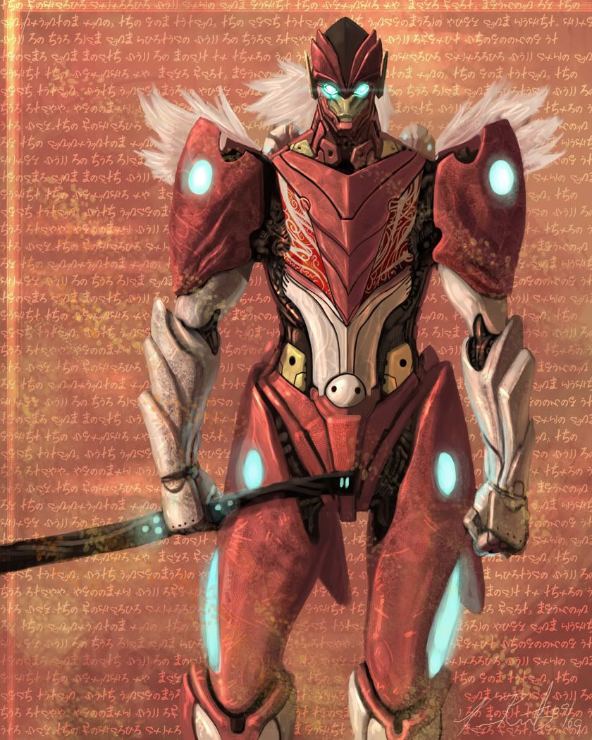
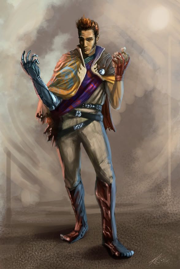
A robot
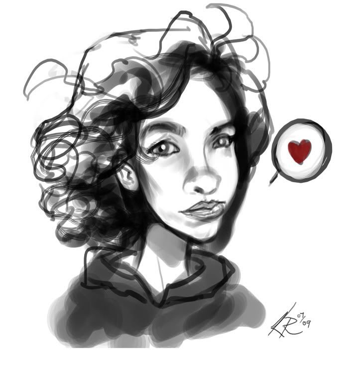
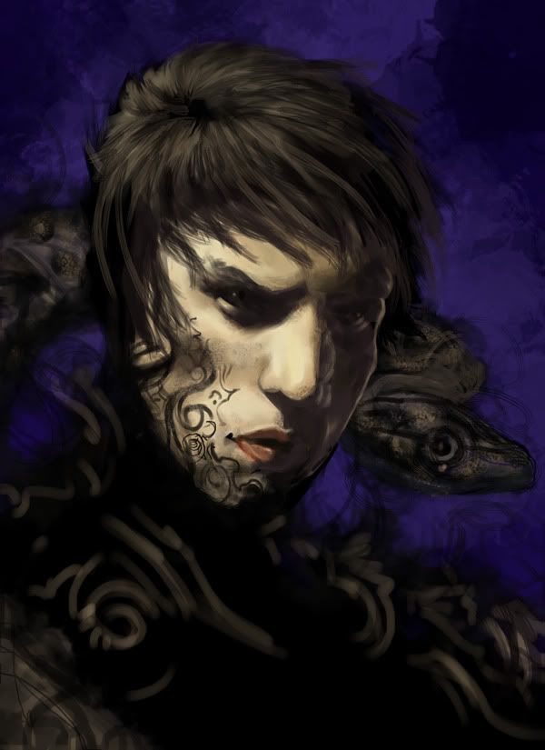
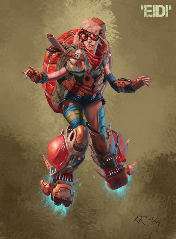
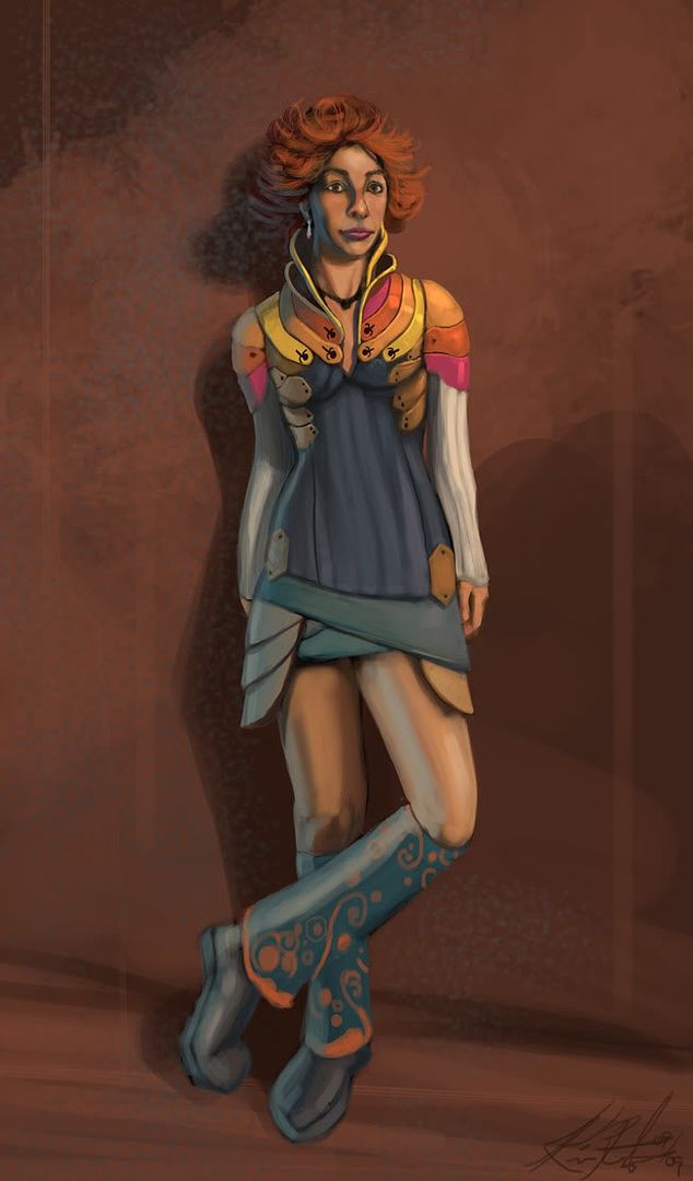
My girl
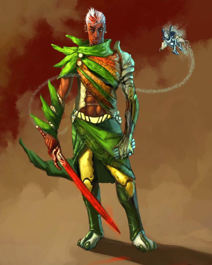
An idea called Tellura Seed that's been on the back burner
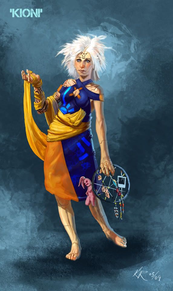
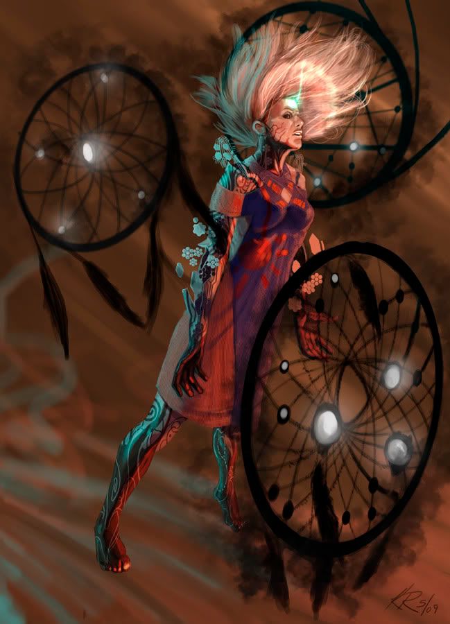
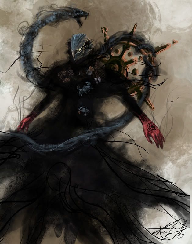
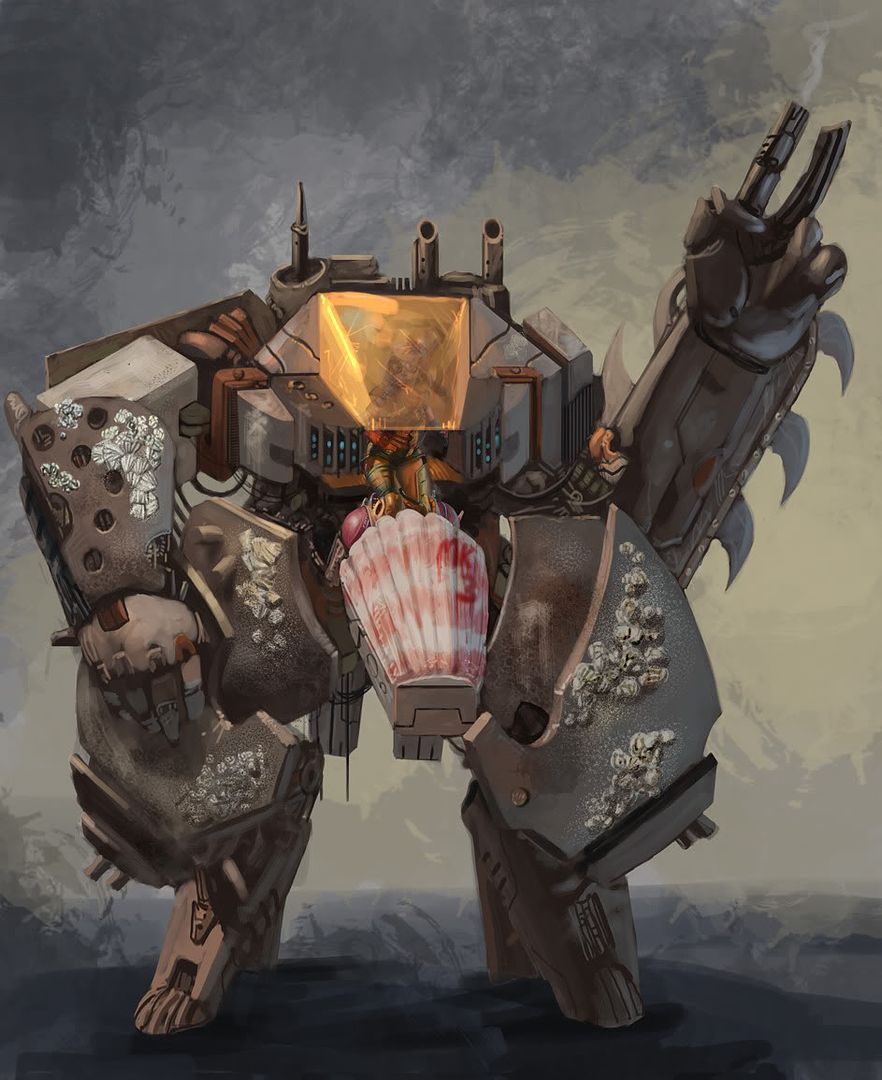
(yes that's Eidi's original drawing composited into the mech. mostly just for proof of concept sake, and a tight deadline)
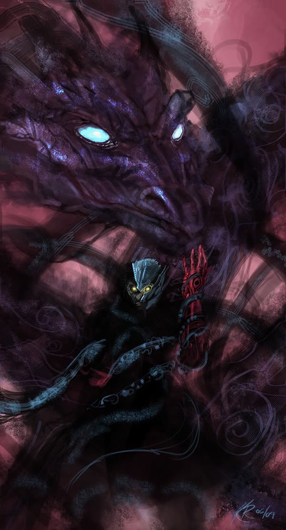
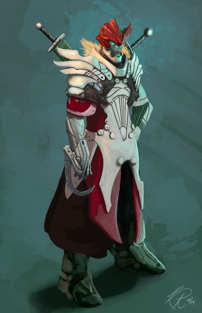
something else in my head for a space opera
annnd the oldest bit that I don't remember if I posted up here last time I checked in

A robot
My girl
An idea called Tellura Seed that's been on the back burner
(yes that's Eidi's original drawing composited into the mech. mostly just for proof of concept sake, and a tight deadline)
something else in my head for a space opera
annnd the oldest bit that I don't remember if I posted up here last time I checked in
Lalilulelo on
0
Posts
But hey these are dang sweet, cool ideas and way better overall than the last time I checked your stuff!
You're much better now.
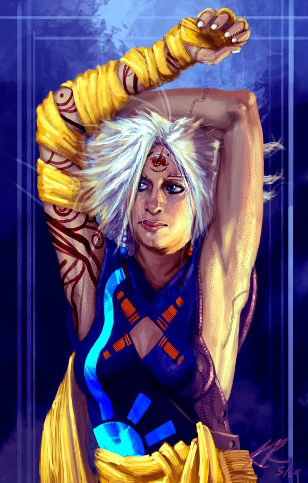
Some pretty slick concept stuff going on, though. Even if that white haired chick changes weight between every one.
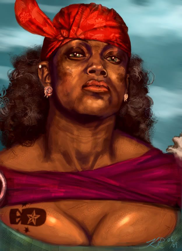
I mean, all you've done is make him a black woman
/hermit crab
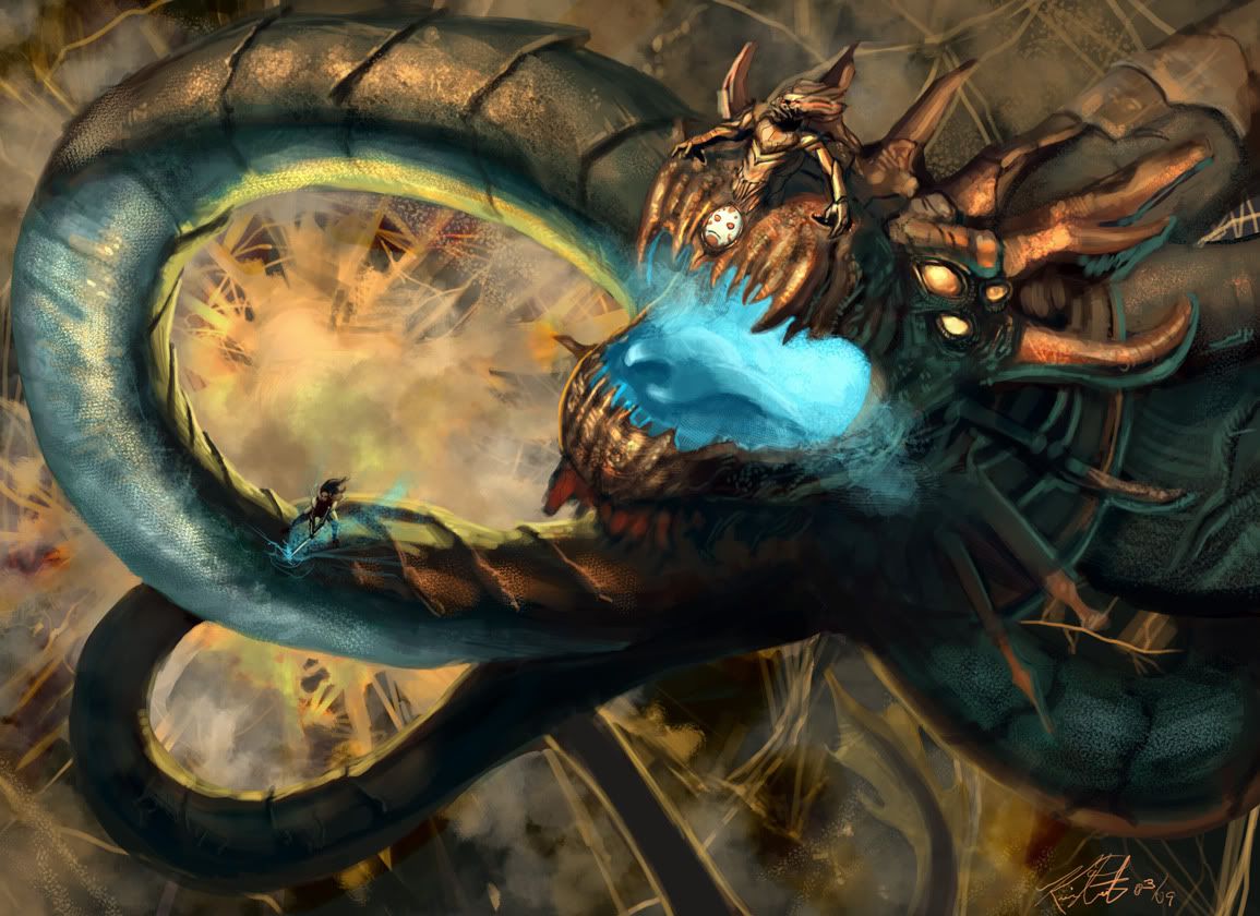
You have similar problems at other times (like on the dragon that is spiraling out) because the texture keeps the same pattern size even though its moving father/closer the point where we are observing from.
I never played FF8
*googles ward*
O_O >_<
@ Napupuchino: First pic, only texture I see overlapping figure and background is the dust in the air. On the dragon though, yeah I know what you mean
Thanks for responding guys.
Something to watch out for next time. I'd personally like to see some good 'ol fashioned oil paintings being posted, so you don't have the crutch of fancy brush effects to lean on.
Agentflit - I may be way off the mark (didn't have any buxom sistahs to pose for me (you know, writing that out, I realize, this is my curse, this is a problem)) but I was thinking, this woman is very voluptuous, very buxom, if she were a combatant, she'd have 'the girls' strapped down and supported, so they might be tight against her body, and not sitting like they were just in a bra. That's an explanation, but it's certainly plausible that I just fucked it all up.
It's like he got into a crash and bought the non-matching replacement panels because they were cheaper.
Just some food for thought.
Not that I'm saying you can or cant, but it's just kind of a weaker aspect of the pieces.
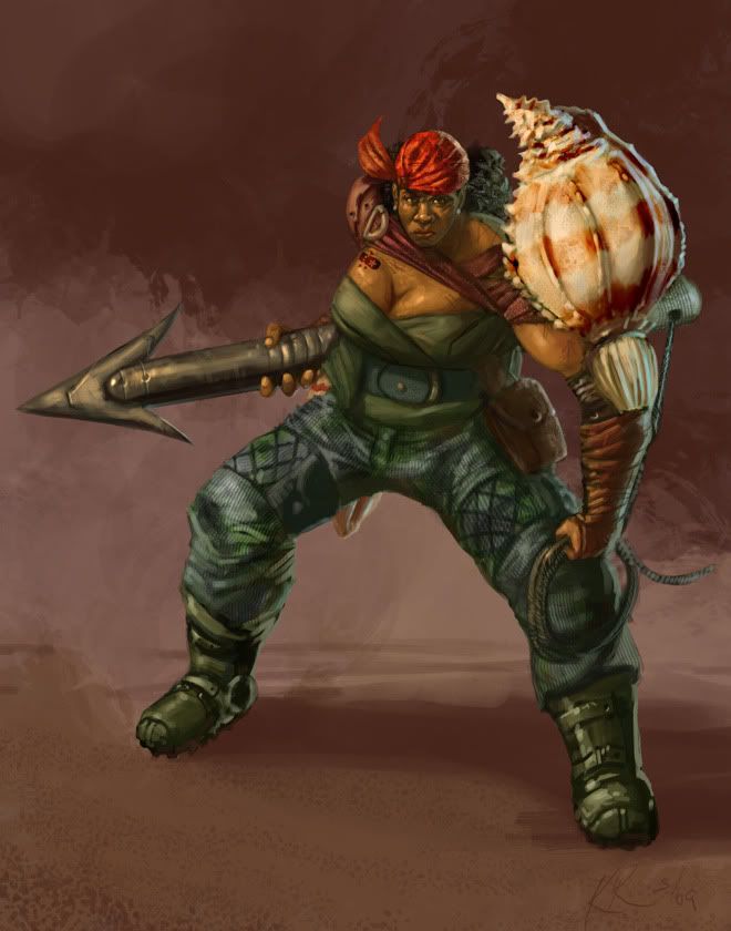
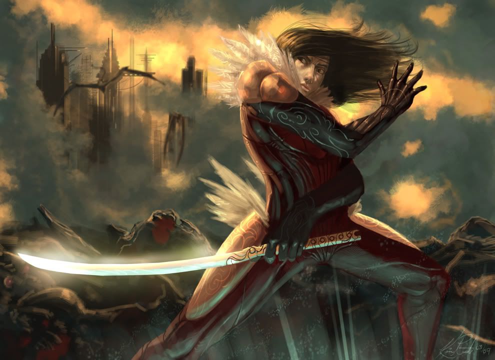
Some of your foreshortening and proportions need a little bit of work. And watch the perspective on accessories. For example, in this image the sword on his back is very flat:
I'm not really going to point out specific examples of all of these points, though. For the most part, I'm trying to see consistent errors through the majority of what you posted.
That said, overall these are very strong. You have a good (if exaggerated)sense of color, shape, depth, and posing. You're also clearly very familiar with the medium, and you use it well. Usually I'm not fond of excess usage of custom brushes, but you pull it off pretty well (- even if it should be reigned in a little bit). Keep working at it.
And the texture thing.... I dunno-- sometimes even I think I've overdone it, but just as many people like it (besides me, I swear) as there are who don't...
I missed ya'll.
The monster-huge-dragon also made me happy.
http://img.photobucket.com/albums/v368/Lalilulelo/Sanjuro-1.jpg
I think you did a great job explaining the forms, and still got some cool textures/color, but it wasn't overdone, and it doesn't kill the form (like it often can).
Also, i though the hook picture looked REALLY badass in the black line drawing you had, but some of that badassery got lost in the painting.
J'agree.
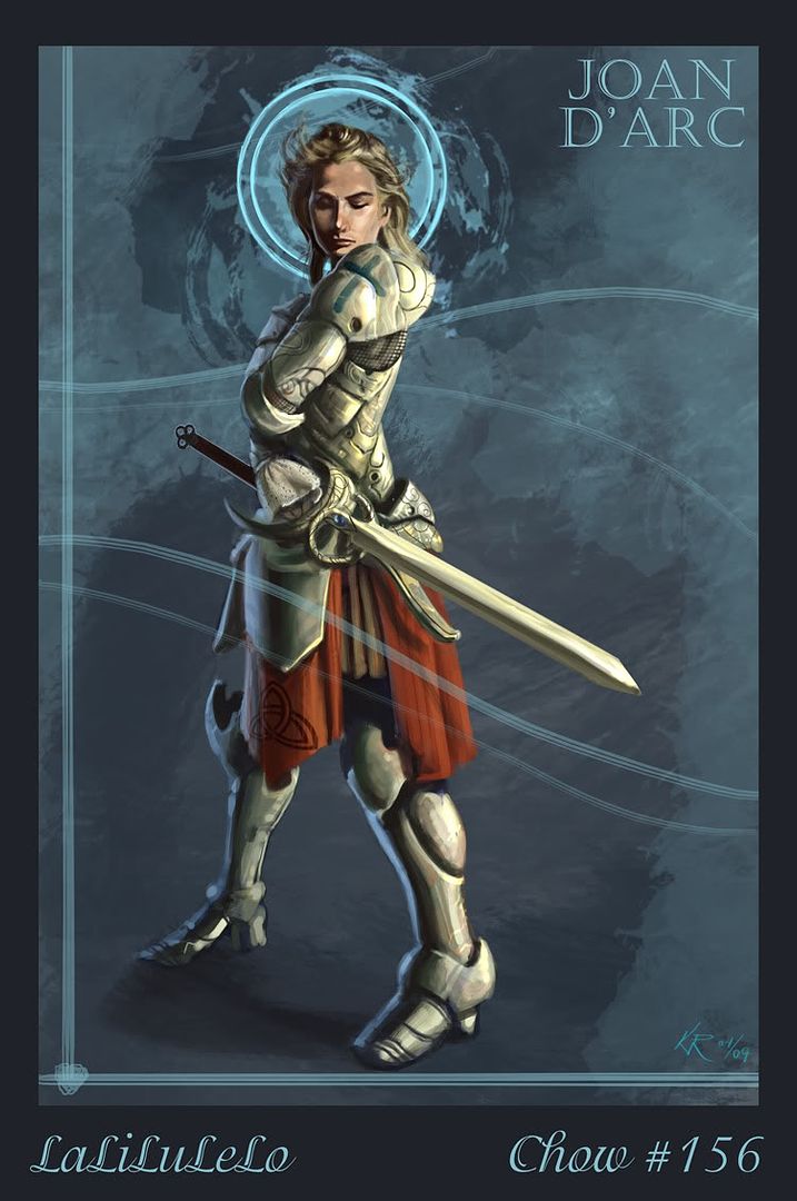
The face in the Joan D'arc one is also lovely, but the rest of the piece could use some tightening.
http://kvitella.carbonmade.com
http://forums.penny-arcade.com/showthread.php?t=91454
artistjeffc.tumblr.com http://www.etsy.com/shop/artistjeffc
The similarities are there, but not overwhelming IMO.
sort of similar poses, that's it, but i feel lal's feels much less awkward.
artistjeffc.tumblr.com http://www.etsy.com/shop/artistjeffc
Ok...what just happened? Was I just insulted or....?
http://kvitella.carbonmade.com
http://forums.penny-arcade.com/showthread.php?t=91454
what?
i'm really confused now.
I think prox was being odd.
That is a frickin awesome piece, though. Probably my favourite out of everything you've done ever. Base drawing looks nice, face is fantastic, colour scheme is good and you haven't overused that cyan highlighting trick.
like, I am going to randomly combust into a raging inferno and die one day from the amount of internet to real life-ness that is happening