An update on recent technical problems and more from the admin: https://forums.penny-arcade.com/discussion/250292/on-technical-difficulties-mod-coverage-and-other-things/p1?new=1
Options
Let me [DOODLE] your noodle [NSFW]
beavotron Registered User regular
edit: thanks MKR
lol dunno if anyone will see this seeing how we are on page 100 :P but UPDATE!
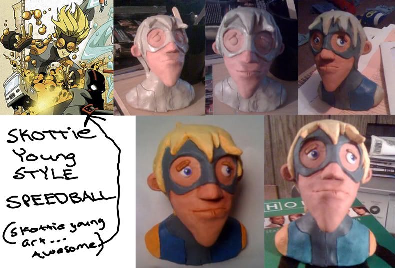
NakedZergling wrote: »SCULPTURE OF SPEEDBALL (SKOTTIE YOUNG STYLE) I DID A WHILE AGO THAT I'VE BEEN PAINTING ALL WEEK. i'M STUMPED ON HOW TO MAKE IS CLEAR GOGGLES AND AM OPEN TO ANY SUGGESTIONS. THANKS!
RAAAAAAAAAAAAGEHJFKL
beavotron on
0
This discussion has been closed.
Posts
hahah nic i think bombs already did that one. if not done.
It's closer to real than anything I've done so far, but it just doesn't seem right. I've been blending colors by setting opacity to brush pressure. Is that a good way to do it, or is it really bad and I just don't know it?
The green background doesn't really help, but at least you aren't working from a pure white background.
Steam handle: Buckwolfe
To the internetmobile!
But now that I take a second look, the entire picture is in the same temperature zone. There's no actual contrast. Just try squinting at it, and you'll see what I mean. The whole thing starts to get really muddy, and the object sorta disappears altogether.
Steam handle: Buckwolfe
I got standards. Wanna be treated like a lady.
Steam handle: Buckwolfe
What if Godfather disagreed that you couldn't disagree more with him?
Steam handle: Buckwolfe
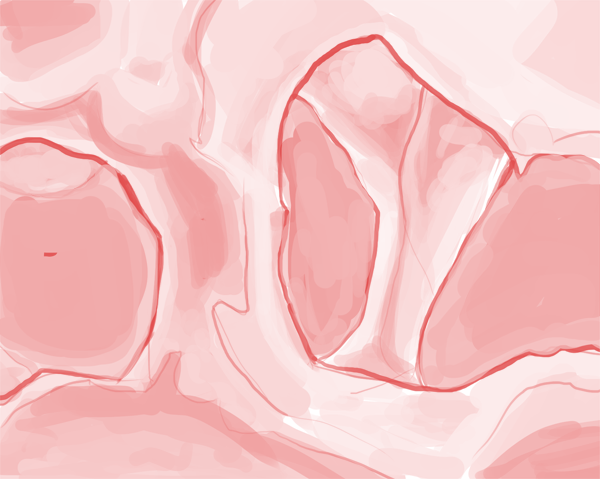
i'm proud of it, but it could definitely be better. thoughts?
first, the colors.
you have used just straight greys
but actually look hard at the colors that make up that round reflective surface
there are some pinks, oranges and yellows in there
they're subtle but they make a huge difference.
you have used two shades of grey that are both of the same green hue
adding more color variety to your painting will make it more believable, since real items are affected by their environments, they are rarely going to appear as one solid color if you look closely. ESPECIALLY something with a shiny semi-reflective surface.
a good trick is to convert the source image to greyscale. then paint your image in greys as well
afterwards, add a color overlay layer and add in the color on top of your greyscale.
it's a method many traditional painters use, and is one i use pretty frequently.
ignore the colors at first, just pay attention to values
then start observing the color variations.
makes it pretty easy when you divide it into two steps like that.
second, you've used sharp edges for the rounded part, and it makes it look angular, not rounded. you need to use a softer brush for areas like that, and a sharper edge where they are necessary. edges is something i myself am working on as well, it can be tricky, but try to pay attention to where something has a sharp edge, and where it is more diffuse. there are no sharp edges on the round base of the holder, however there are edges up near those little wings on the sides.
third, notice the tiny little highlight at the very top and very bottom. adding those in makes a world of difference.
and fourth, your perspective was off on the top, be careful with elipses. get the drawing down as good as you can first, and then cut in all the painty details (mine's also not perfect, but it was a quick and dirty job to get some points in)
Here's what I'd suggest:
Draw it bigger to keep it clean.
Ditch the L shape of the gesture, it makes it look too totem-pole-ish, and sort of more like a centaur-type creature than a caterpillar- it feels more like a 90 degree break than a smooth continuation between upper and lower body. Try curving it towards more of an S-shape- head forward, curving back at the thorax area, curving forward as it hits the ground. If needs to keep its center of gravity near the center for stability's sake- curving the thorax back, so a large part of its upper-body mass are placed above where the lower body touching the ground it will help keep the creature stable. Maybe do some quick thumbs to get the gesture down before going on to the big version.
Also, the thing with a spear is funny and everything, and maybe that's the point, but with those tiny arms it wouldn't be able to thrust a spear very far, and probably wouldn't be all that great weapon. You might try something more along the lines of a halbeard, where is can get a lot more power by twisting its body to get a slashing motion.
Twitter
gonna work on this ASAP. thanks!
Really??
Yes?
Almost.
it's in my thread.
Thanks beavs!
if you're having trouble with values, make yourself a swatch up in the top corner of your drawing
about 5 shades of grey, dark>medium dark>medium>medium light>light
and pick from those to start with
it makes it much easier for some reason when you narrow your value range down
You really don't want to know what this particular character was actually doing in the dream.
Catastrophic blowjob accident?
Twitter
I should probably sketch something to do it with though.
right now you have something very flat, and it looks as though you smudged or applied some sort of filter to it to blend it a little, but there is no depth, it doesn't make any sense.
is the surface rounded or angled?
are you trying to paint something that has flat sides and crisp edges like a slab of rock? or something rounded and smooth with no edges like a bullet?
if it's angled, the perspective is off, you need to define where the faces are
if it's supposed to be rounded, those edges are too crisp, you need to work with bigger softer brushes.
read through this if you haven't already:
http://www.itchstudios.com/psg/art_tut.htm
Photo:
Flickr | Facebook | Classifieds | GigPosters | Twitter | Blog
god more like 200-300 flat
for press yes for the love of god, charge more.
you kids and your low pricing.