As was foretold, we've added advertisements to the forums! If you have questions, or if you encounter any bugs, please visit this thread: https://forums.penny-arcade.com/discussion/240191/forum-advertisement-faq-and-reports-thread/
Options
End of Semester Dump Page 2 [NSFW]
Nineteen Hundred Registered User regular
So, hey, I finally got off my ass and have been studying at the Academy of Art since February, majoring in illustration. Hasn't even been two months, but I think I'm seeing improvement, so I thought I'd share.
Gestures! I've actually got a ton of these, but I only really started to get the hang of it, like, this past Monday, so not a whole lot to show in this area. These were 3 or 5 minutes; I can't remember.
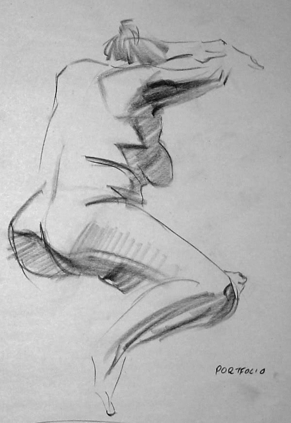
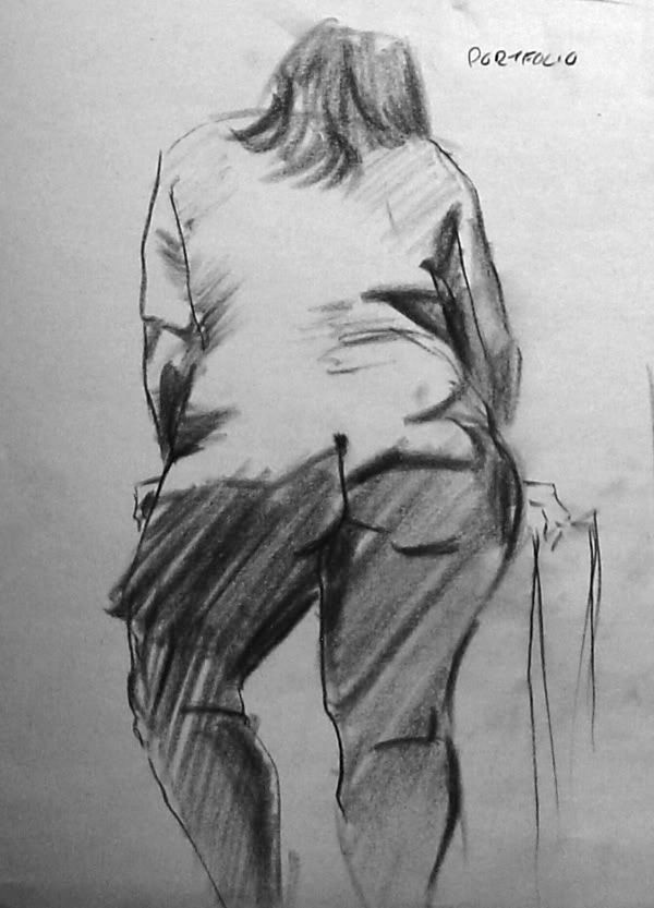
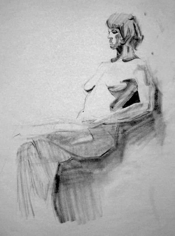
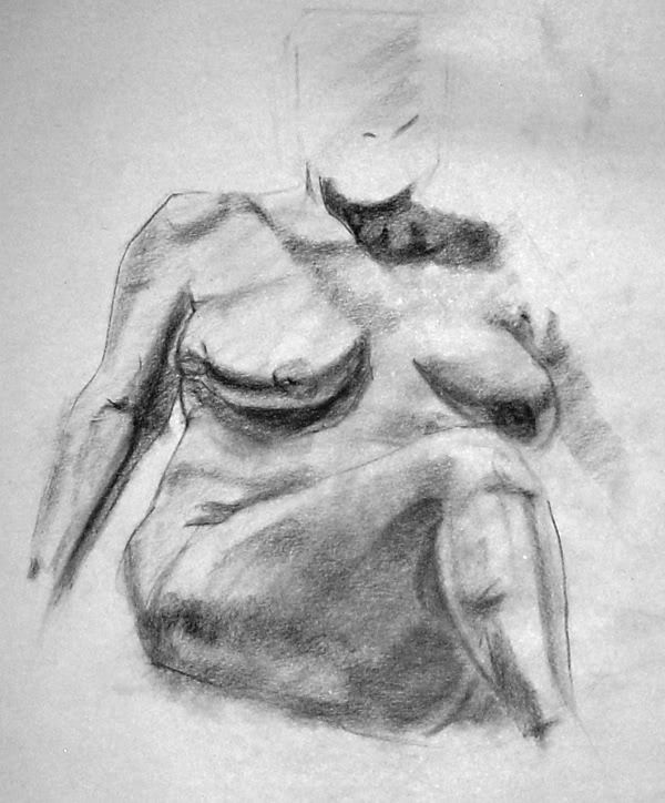
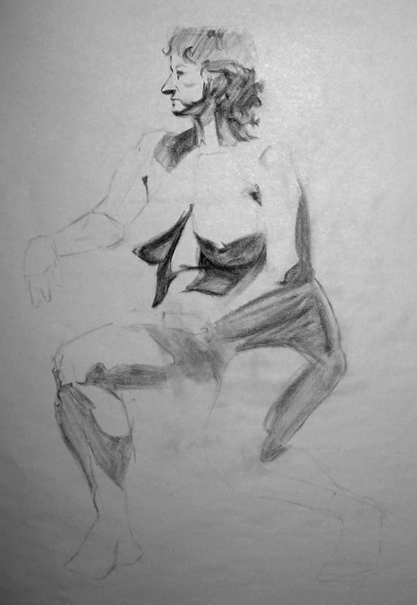
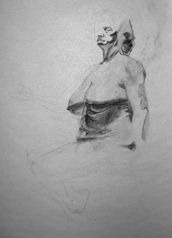
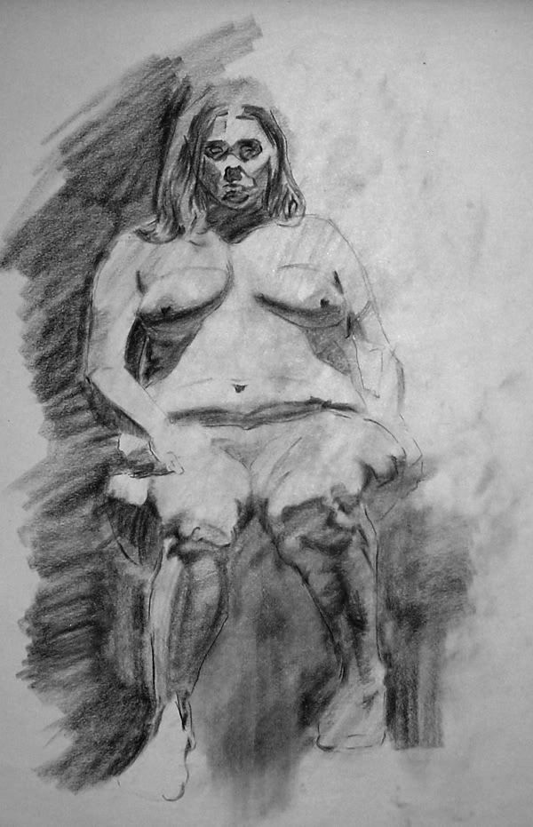
Long poses, ranging between 40 minutes and an hour and a half. I'm really slow here, probably because I get lost in the details really early. It also doesn't help that my figure drawing classes are only two and a half hours.
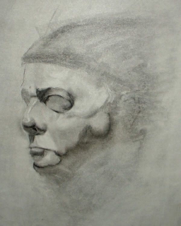
And a couple of head studies. First was with charcoal pencil, second with vine charcoal mostly, both on smooth newsprint. Guess which medium I like better.
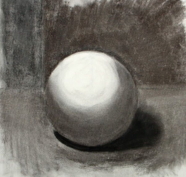
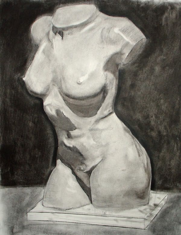
Analysis of Form stuff. Vine charcoal on rough charcoal paper.
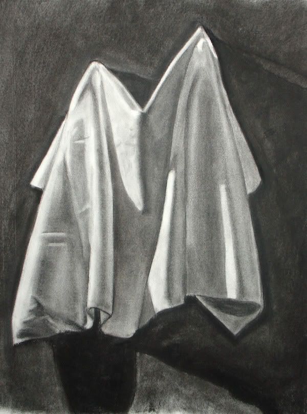
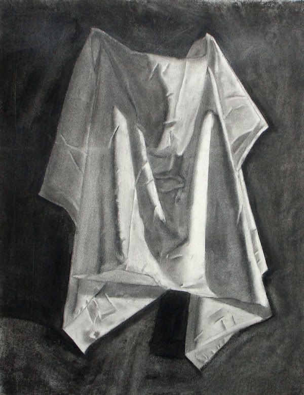
Drapery for AoF. First was in-class, second was at home for the midterm. I got a C- for obvious reasons. Unfinished; sloppy. I need to stop being lazy. Teacher's giving me a chance to fix it up over the break, and he said I could potentially bring it up to a B, but I think I'll just start again from scratch.
Gestures! I've actually got a ton of these, but I only really started to get the hang of it, like, this past Monday, so not a whole lot to show in this area. These were 3 or 5 minutes; I can't remember.
Long poses, ranging between 40 minutes and an hour and a half. I'm really slow here, probably because I get lost in the details really early. It also doesn't help that my figure drawing classes are only two and a half hours.
And a couple of head studies. First was with charcoal pencil, second with vine charcoal mostly, both on smooth newsprint. Guess which medium I like better.
Analysis of Form stuff. Vine charcoal on rough charcoal paper.
Drapery for AoF. First was in-class, second was at home for the midterm. I got a C- for obvious reasons. Unfinished; sloppy. I need to stop being lazy. Teacher's giving me a chance to fix it up over the break, and he said I could potentially bring it up to a B, but I think I'll just start again from scratch.
There was something important here. It's gone now.
Nineteen Hundred on
0
Posts
The drapery studies look good.
EDIT: On the draperies, they look okay in the photos, but in person there are obvious flaws. I don't know what it is with the lighting in my room, but my works tend to look a 1000 times better than they really are.
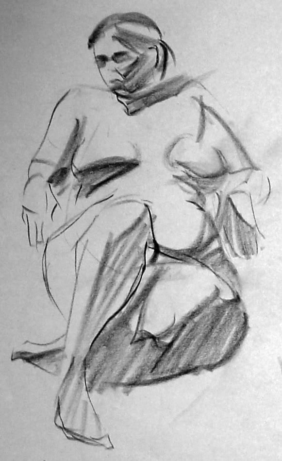
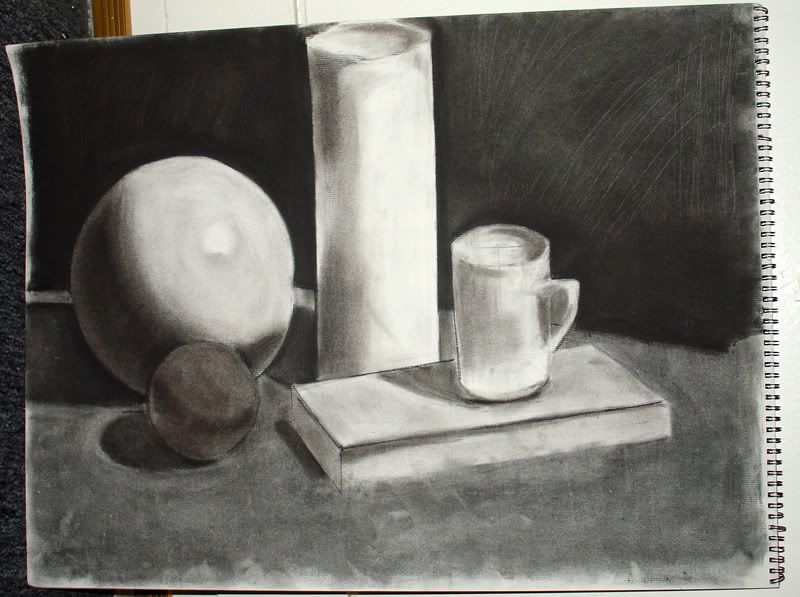
The first two figs are looking pretty good, as well as the last cloth study. You definitely need to put a little more love into your torso and your still life.
Don't be so down on the school. There are a lot of really amazing and inspiring teachers that you would do well to listen to and learn from. Art school isn't this magic, "well make you good at art" place. You have to take what you learn in class and apply it on your own time. This school is really really good for illustration and if you apply yourself and have a positive attitude you can come away with a lot.
Did you go to AAU, DeeLock?
Tell him that some hat-wearing dude from the internet thinks his book is friggin' awesome for me.
Twitter
Bacon: I really need to get around to buying that book....
You're in really great hands with Henry Yan, dude's a master, and I think David Lee is a really good as well, you do have to ask him for help because he probably won't actively help you out unless your drawing has some major issues.
I'm actually in his class right now, Monday and Wednesday in the morning.
Who's your figure modeling teacher? It would be trippy if we were in the same class.
Shit. I'm the Indian guy. Look for me after the break.
Oh, and my Figure Modeling teacher is Mark Zwawi... Zhawin......
My teacher is Mark.
EDIT: Just remembered there's another Indian guy in that class. I'm the skinny one named Chris.
My name's Dylan, I'm the tall white dude with glasses.
edit: Oh man I know you! You were wearing a MS Paint Adventures t-shirt one day and a Penny Arcade one the next! I was totally going to talk to you but then I didn't :P
Yeah, I've got one of those "Fuck off I don't want to talk to you" faces. I'll try to turn it off when I see you.
Your 5 minute studies seem to show a lot more form than your longer studies. Though not as detailed in rendering, they are more believable. Perhaps its the loose aproach. Just an observation
Keep posting!!!
wck: Yeah, I've noticed that too. I think the ultra-slow pace I take with long poses actually messes with my line quality. I'll try moving at a more moderate pace next Monday.
INSTAGRAM
EDIT: Was a little to close when I took the pics, so there's a bit of a fisheye distortion going on there. He has feet and proper proportions, I assure you.
Nice work.
Ninteen Hundred, I totally agree with WKC here. Overall, your stuff looks good. A lot of your choices are going in favorable directions. Your 3-5 minute sketches (especially the first two) are sympathetic, and they look great. Also, those cloth pieces are nice. Incidentally, the proportions on that shapes study are really off; that piece doesn't belong with the rest of your work.
The longer studies kind of fall apart. They're (like you said) too fixated on details, which happens here at the cost of form/proportions/gesture/overall quality. It doesn't seem like a big problem though, simply because you appear to have a knack for self-improvement. You'll work it out.
p.s. This longer study is pretty good:
The facial expression/body language is bizarre, and the figure is plopped-down in an interesting way. The legs could be a little bit less dirty, and then they would support the rest of your shading choices. Oh, and maybe turn those big dark shadows on her left and right into shapes, or define them with some dark lines like I did here in MSpaint.
Paradise: I've completely changed my approach to long poses since I drew that one. I'll have some up in the next week or two, but I think I'm on my way to remedying the issues you brought up.
Just a suggestion
also omfg gecko eyes
edit: seeee, crested geckos and whatnot would be a great example because they sort of have shit goin' on there already, sorta flowery
So have you been draping a wet towel over it to keep it moist? I wish i could take a ceramic class.
As for the diamond like lace, can you convert them into leaves? Like long banana leaves or something?
ex.
http://mayang.com/textures/Plants/images/Leaves/long_thin_veined_leaves_031225.JPG
http://farm1.static.flickr.com/1/122475896_828210ed55.jpg?v=0
And yeah, SOP is to put something wet on there to keep it moist when you're not working on it. I was using a t-shirt, hence the bluish smudges around her shoulders (which she doesn't have anymore. Didn't feel like designing anything past her neck, so I just cut 'em off).
Thanks for all the help, guys!
Yours isn't pretty good it's pretty rad.
A few long poses:
Figure drawing final. A copy of a master work:
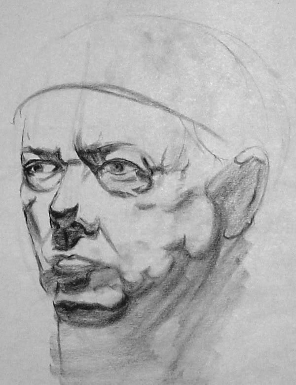
Analysis of Form final. Portrait of Phillip Glass from a photo by Chuck Close:
Flash washed out some of the detail by his left eye, but I don't feel like doing it over.
one overall issue that can be solved easily with a blending stump. or if you are anal you can layer more tone on with a pencil. The issue being he looks like hes made out of metal- mainly because youve got your highlight value showing up on forms all over the place. I cant tell where the lights coming from specifically but its somewhere up top. His abdomen and chest need to be knocked back. along with the shoulder hes casting a shadow onto.
stump is easiest method. then you can restablish your form line hatching over the new greytone the stump gave you. or brush on powdered graphite.
hed also have a hell of a time finding shoes.. looks like he wears a size 15 on his right and a size 8 on the left.
you also need to practice cleaner drawing habits. They have gloves that will keep you from smearing shit all over the place or you can just get a peice of tracing paper to rest your hand on. Its a big thing.. and its an easy fix. It immediately screams amateur when you cant even keep your hand from rubbing shit everywhere.
And bonus: The original sketch for the Flower Girl up there:
EDIT: Also, I never liked blending stumps. They always seem to do a whole lot of nothing, even with really soft charcoal. My fingers are far more effective. I don't see how, but maybe I'm just not using them right?
I use differnt stumps for graphite and charcoal so I dont get one drawing medium on the other drawing etc.. Again I think its just a paper thing. Depending on what type of charcoal you are using a soft round brush is a better blending tool.
Do you have intentions of taking that master copy further? Correct mistakes? I can pick some things apart if you want..
Drawing on the other hand has started to become dull, but at least i can get some of my ideas on paper so it's not something a despise.
Your clay figures are really good as well.