As was foretold, we've added advertisements to the forums! If you have questions, or if you encounter any bugs, please visit this thread: https://forums.penny-arcade.com/discussion/240191/forum-advertisement-faq-and-reports-thread/
Options
Stinky fingers art. NSFW
stinkyfingers Registered User regular
Registered User regular
Hi, I posted here before but I cant seem to post in my other thread....In the time ive been inactive ive been aslo exploring 3d and hopfully going to launch a webcomic or two. thanks for looking.
Comments and critiques are always welocome.

Comments and critiques are always welocome.
http://eddieble.deviantart.com/
http://conceptart.org/forums/showthread.php?261761-RJbonner-2d-3d-Artist
http://www.polycount.com/forum/showthread.php?t=78501
http://conceptart.org/forums/showthread.php?261761-RJbonner-2d-3d-Artist
http://www.polycount.com/forum/showthread.php?t=78501
Grifter on
+1
Posts
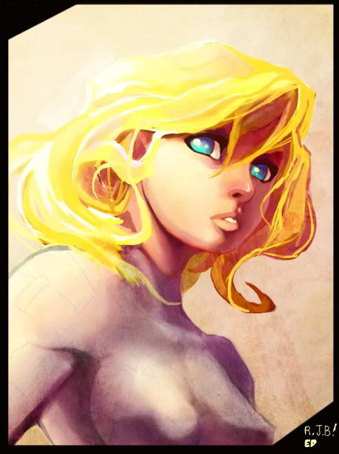
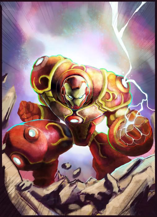
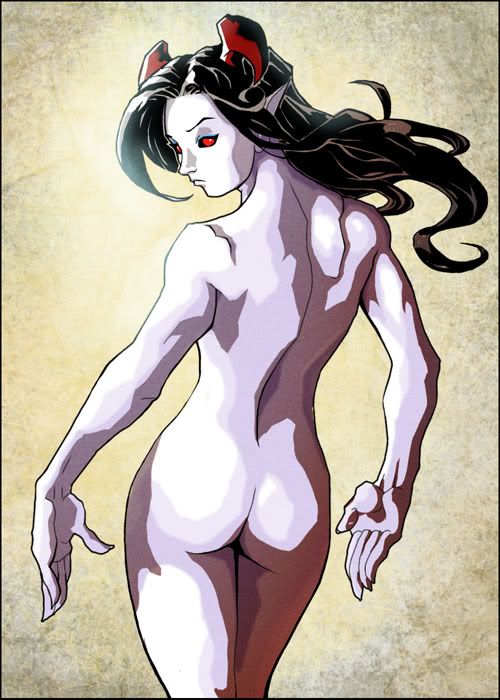
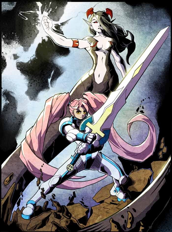
but fiorm there (oldest to latest is the iron man, the lady profile, naked horn lady, paladin and sorcerous and the panned out veiw of the swordgirl.
thanks for looking, I have a 2d and a 3d peice in the works that I juggle.
http://conceptart.org/forums/showthread.php?261761-RJbonner-2d-3d-Artist
http://www.polycount.com/forum/showthread.php?t=78501
anywho first digi draing in like 8 months, just to loosen up, moving to 3d again.
as always any crits and comment are apreciated. my end goal is to end as a VG modeler so dont hold back!
http://conceptart.org/forums/showthread.php?261761-RJbonner-2d-3d-Artist
http://www.polycount.com/forum/showthread.php?t=78501
Ha, sometimes you just have to sacrafice to get where you want to be.
thanks man, that was my first 3d attempt, the geometry is realy poor so I couldent be used in any form of media.
I do take inspirations from Mr. mad. also frazata, anime and video games. From what Ive heard, I should tear away from My manga influence or at least vary it.
http://conceptart.org/forums/showthread.php?261761-RJbonner-2d-3d-Artist
http://www.polycount.com/forum/showthread.php?t=78501
karin zanzuki from SFA3 I thinks her name. getting better at 3d. hopefully i can post a game ready asset sooner or later.
WHIPS
http://conceptart.org/forums/showthread.php?261761-RJbonner-2d-3d-Artist
http://www.polycount.com/forum/showthread.php?t=78501
karin zanzuki from SFA3 I thinks her name. getting better at 3d. hopefully i can post a game ready asset sooner or later.
WHIPS
http://conceptart.org/forums/showthread.php?261761-RJbonner-2d-3d-Artist
http://www.polycount.com/forum/showthread.php?t=78501
My Artist Corner Thread • Everywhere I Post
which one, the earlyer one or the revision?
thanks man, I gotta jump back on that one.
http://conceptart.org/forums/showthread.php?261761-RJbonner-2d-3d-Artist
http://www.polycount.com/forum/showthread.php?t=78501
http://conceptart.org/forums/showthread.php?261761-RJbonner-2d-3d-Artist
http://www.polycount.com/forum/showthread.php?t=78501
http://conceptart.org/forums/showthread.php?261761-RJbonner-2d-3d-Artist
http://www.polycount.com/forum/showthread.php?t=78501
The girls face (in the 3d model) seems a little rough, but overall I like it. I think there may be some lumpiness in areas that's a bit unnecessary, you could maybe smooth out some muscles and simply some forms for more cartoony definition. Don't forget to have visual breaks in your armor design too. If everything is super busy with details and textures, the whole design will look cluttered.
Thanks for the crits!
anywho I decided to do a nice render before I sculpt out the paladin.
http://conceptart.org/forums/showthread.php?261761-RJbonner-2d-3d-Artist
http://www.polycount.com/forum/showthread.php?t=78501
someore stuff for the enviroment.
http://conceptart.org/forums/showthread.php?261761-RJbonner-2d-3d-Artist
http://www.polycount.com/forum/showthread.php?t=78501
http://conceptart.org/forums/showthread.php?261761-RJbonner-2d-3d-Artist
http://www.polycount.com/forum/showthread.php?t=78501
All game models.
http://conceptart.org/forums/showthread.php?261761-RJbonner-2d-3d-Artist
http://www.polycount.com/forum/showthread.php?t=78501
http://conceptart.org/forums/showthread.php?261761-RJbonner-2d-3d-Artist
http://www.polycount.com/forum/showthread.php?t=78501
It feels like you are sometimes losing yourself in the details, making the forms hard to read, or making the scale of things seem off, etc. The forms in your first character are extremely hard to read. Everything it hyper reflective, and the same color (even the background). The texturing on the swords is so intense that you lose a sense of what's going on...the wear that you've added on makes the swords look like stone rather than metal. The texture scale on the cloth is enormous - if the weaving was that large, the cloth would not drape that way.
In your environments, the sense of scale is a little borked...you have stairs in that one piece, and these giant bannisters that [if I hadn't seen the stairs] would look like they're meant to be a few feet high. With the stairs, though, it seems like the bannisters are 10-12 feet high. There's a bit of a conflict there. I can see a similar issue in the last environment - the stairs are large enough that I would imagine a 6-foot character would bump their head on the ceiling.
When you do wear in the diffuse/specular textures, consider how it's interacting with the read of the forms of your model. For your vehicle with the turrets, the burnished edges that you have are VERY bright and VERY clean. When paint chips on metal, it looks much rougher, and is not as evenly dispersed across an edge, as you've done. The brightness of the burnished edges, and the fact that you've placed them in a LOT of places, across all your tiny little details, is making the larger forms get a bit lost.
So yeah...overall, your work isn't bad! Just try to focus a bit more on how the forms are reading, how the scale is reading, and try to use reference when you're looking up wear on a specific material.