As was foretold, we've added advertisements to the forums! If you have questions, or if you encounter any bugs, please visit this thread: https://forums.penny-arcade.com/discussion/240191/forum-advertisement-faq-and-reports-thread/
Options
A Foray Into Webcomics
DrScientist Registered User regular
Registered User regular
Hello AC,
I am a hobbyist when it comes to art. I like to draw and paint and took quite a few art classes in high school, but ended up not focussing on it in college. I have done a lot of pen/pencil and paper drawing and have tried different styles, but I've never really been able to translate my drawing over to digital.
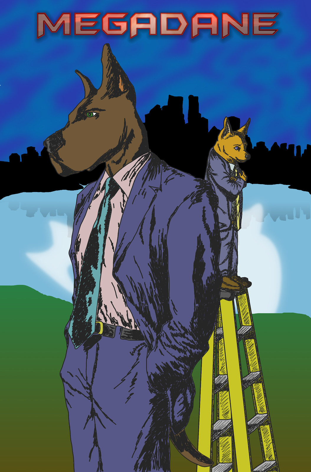
I have more recently purchased a Bamboo tablet and am working from that. What I would like to do is do a webcomic, I already have the idea and everything behind it decided (a story involving a group of friends and seeing a great dane and a chihuahua next to each other brought forth the whole concept). The name of the comic is Megadane and for purposes of ease of website, I am hosting the comic via blogger. The story is about Megadane, a CIA agent and his life as he goes about being an agent, a husband, and a dad and his sidekick and partner Micropup.
What I am looking for are critiques to make my comic and skills better and possible ideas about how to transfer what I can do on pencil and paper to digital via a tablet. Right now all I have up is the cover page I have created. I am not entirely a fan of the background of the image but I do not know what I can do to make it better. I also do not like how my characters seem to pop from the background. The software I'm using to draw the comic is GIMP as it is free and I don't have the cash for a more expensive software.
Thanks.
I am a hobbyist when it comes to art. I like to draw and paint and took quite a few art classes in high school, but ended up not focussing on it in college. I have done a lot of pen/pencil and paper drawing and have tried different styles, but I've never really been able to translate my drawing over to digital.
I have more recently purchased a Bamboo tablet and am working from that. What I would like to do is do a webcomic, I already have the idea and everything behind it decided (a story involving a group of friends and seeing a great dane and a chihuahua next to each other brought forth the whole concept). The name of the comic is Megadane and for purposes of ease of website, I am hosting the comic via blogger. The story is about Megadane, a CIA agent and his life as he goes about being an agent, a husband, and a dad and his sidekick and partner Micropup.
What I am looking for are critiques to make my comic and skills better and possible ideas about how to transfer what I can do on pencil and paper to digital via a tablet. Right now all I have up is the cover page I have created. I am not entirely a fan of the background of the image but I do not know what I can do to make it better. I also do not like how my characters seem to pop from the background. The software I'm using to draw the comic is GIMP as it is free and I don't have the cash for a more expensive software.
Thanks.
0
Posts
As for the background itself, I would suggest using photo reference. You don't have to follow it exactly, just get an idea of what you want your scene to look like. Even a hint of reality will help ground the action.
Of course, none of that has anything to do with comics, but for this illustration, that's the best I got. There are far better artists than me on here, and they can probably help you more.
Your art is doing the opposite, the background is heavily contrasted, and your characters are washed out.
Also, post more work to help us get a better feel for your work.
I also have some other images that I got scanned in. These are only a few examples. I need to find the rest of my drawings and get them scanned up.
And this is the reference I drew from.
I also have a question which is software related. My lines are very ragged why I draw in GIMP. What can I do in GIMP to make them look smoother?
And just in case you want the full skinny on drapery instead of the vastly simplified version I gave:
http://www.meadowpaint.com/drapery1.pdf
http://www.meadowpaint.com/drapery2.pdf
http://www.meadowpaint.com/drapery3.pdf
http://www.erikgist.com/drapery4.pdf
This is all good information, don't get me wrong- but it may be overwhelming and distract you from more important matters at this point. (If the simple version was good enough for Disney animation for the better part of a century, it should be a solid place for you to start getting a handle on the subject.)
Twitter
Well, I'd rather not come across as trying to force a 'look' on you so much- I try my best not base critiques on style- it's more that grasping the simple aspects of drawing is useful because while on one hand you can use it to achieve a simple, clean look effectively, those same principles are also the key to being able to achieve more detailed, rendered results if you so choose.
People that are really good at detailed drawing don't start by trying to grapple with every wrinkle and line- they start out with the same simple setup, and merely layer other simple concepts on top of that in progression; the end result may seem very complicated and hard to fathom how they arrived there, but that result was derived from seeking out the simplest possible solutions at each stage.
Simple composition -> simple gesture -> simple construction -> simple rendering.
Once the basics are in place, the details are just using that same process and principles, and applying them at a smaller scale.
For example, the guy who taught me the whole CSI layout method and wrote those drapery .pdfs?
His bread and butter is not simple cartoon characters, it's really detailed stuff like this,
http://3.bp.blogspot.com/-c8RfpoDGGNM/T07kIQbeLCI/AAAAAAAAB4Q/IpdIxrQHQ8Y/s1600/dragoncover3.jpg
, and that same exact method would have been used to lay out the extremely complicated figures in that extremely complicated painting. He could only make a painting as complicated as that work by mastering simplicity first.
You don't draw complicated things by thinking about how complicated they are; you draw complicated things by figure out how to break down that complexity into a few simple, manageable ideas.
That's why stuff like that enrichment thread exist- nobody really needs or wants to render out a bunch of solid colored cylinders and spheres and cubes for it's own sake, it makes for some pretty boring pictures on their own- until they find out that since everything can be broken down into cylinders and spheres and cubes, and realize that it's an absolutely essential skill to have and practice in order to render anything effectively. It's one of those simple ideas that makes complicated ideas possible.
Twitter
I like how this turned out even though I'm not sure the picture shows it that well.