As was foretold, we've added advertisements to the forums! If you have questions, or if you encounter any bugs, please visit this thread: https://forums.penny-arcade.com/discussion/240191/forum-advertisement-faq-and-reports-thread/
Options
The Art of DungeonFire
DungeonFire ArtistUSARegistered User regular
ArtistUSARegistered User regular
Hey all, I am new to this forum, but a long-time PA fan. I love that so many talented people share their artwork here, and I want to be a part of that. I have, for the last year or so, been working on making my own board game as a side project, and I have accumulated well over a hundred illustrations big-and-small as part of that process. I am still only about halfway finished, and when I started I had ZERO experience working with digital illustration, so I have been doing this without too much in the way of feedback... but more importantly, it has been a very solitary sort of project, and I would love to have some people to share it with. As it stands, I have one friend with whom I share my works as I go along. I am hoping that perhaps I can make some new friends here to share with who can help to keep me motivated to finish this immense undertaking.
To that end, my plan is to post one picture every few days (I'm thinking Monday, Wednesday, Friday) in this thread. Feel free to comment, to give feedback, ask questions or anything else.
(Oh... and it is a fantasy dungeon-crawler board game... so... context and all)
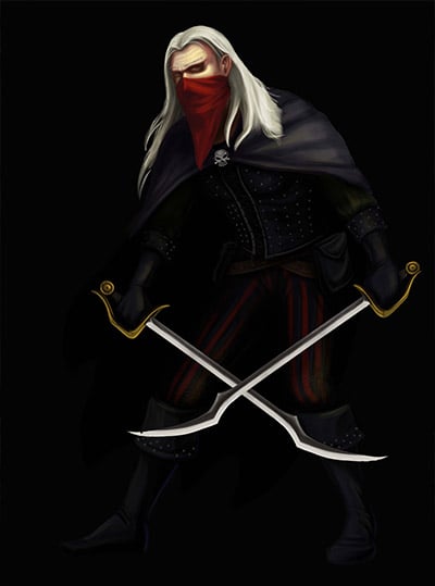
July 14th Image: The Rogue
To that end, my plan is to post one picture every few days (I'm thinking Monday, Wednesday, Friday) in this thread. Feel free to comment, to give feedback, ask questions or anything else.
(Oh... and it is a fantasy dungeon-crawler board game... so... context and all)
July 14th Image: The Rogue
DungeonFire on
0
Posts
Indeed.... its an older piece, and there is no intent to print it with a black background.... just happened to be the state of the PSD for whatever reason. Since these are all intended for a specific print purpose, they are all done with transparent backgrounds for the most part.
Edit: I will make sure to post future images without the black background, and I will go fix the original as well.
As a side note.... man this feels really awkward posting here... for some reason I am always fairly embarrassed by my own work. So, in order to mollify myself and provide some sort of preemptive excuse for the work I am showing, I want to mention that the most I have spent on a single illustration in this set of works is 6-8 hours total, and with only a few exceptions nearly all of these were done in a single sitting. Okay, unnecessary and ineffectual self-deprecation over.
July 16th Images: The Mage
Thank you, and yes... the shading is definitely off. I think the concept started okay-ish, but I lost a lot in execution. This was really early in my attempts to work digitally, and at the time I was using a tiny little Bamboo tablet with the standard grip-pen to work on with an old crappy monitor that displayed everything all wonky. Case in point:
This was my first go at making the paladin character for my project:
And then I got a bit better in a few months and decided that it needed a complete reworking....
So here is the newer version:
And its been like this for a while. I make some art, I get better, and all the old stuff looks like crap. And then that cycle comes back around and happens again and again. I know that that is very normal, but this is supposed to be one cohesive project with about 600 images, and I refuse to shortchange newer pieces to fit in with older ones. I dont think that any of this will ever actually get published, but I do want to go get my board game printed so I can play it with friends at some point in the next century. Sooo going back to redo things has become a bit of a problem, and at this point I am gunning to just get everything done and THEN I can go back and redo the things that stand out as the worst images.
But it nags at me. I am always thing if I could afford to just spend a little more time with each image... If I could just fix up 10, 20, 30, 50 of them... and some just look sooo bad and are from so long ago that I cant help but redo them right away. So, for another example... I did the warrior for the game as one of the first illustrations, probably 10 months ago or so. Eight months later I only saw an immense eye-sore.... so I had to redo it.... here is the side-by-side comparison.
And already I can see huge problems with the newer version... things I want to fix and change and touch up.... or completely redo... but these are all going to be printed at about 2 inches tall.... so how much am I just driving myself nuts for no reason? Because in another 6 months, I am going to want to redo everything all over again.
The problem with working on black or white backgrounds is that they completely throw you off in your sense of value and color, and it's very easy to go much too saturated, much too dark, or much too light with your color choices. Ever since I learned that trick, my color and value choices have been a lot more accurate!
Your material definition also needs some work...everything is rendered the same way - nothing seems to be reflective or shiny. Try to do some studies of different materials (definitely on a neutral background, again). Some good materials to study might be glass (refraction), metal (reflection), hair, jewels, burlap, oiled wood, a plastic computer mouse, satin, etc.
Look at this, for an example:
http://24.media.tumblr.com/d853d13fe612e5c3fea68ea6a70b6d7b/tumblr_mhz3ohFUGc1rcq9lto3_1280.jpg
See how the armor reacts to the light, compared to the red cape or her hair, or her leather gloves. Look at the things around you, in your room, and see how they react to the light.
With long term projects there is going to be some degree of looking at the early stuff and hating it. Its just sort of part of the whole thing. Its tempting to go back and redo them, but if your project has a defined endpoint, I would plow forward for a little. You can redo a few bad ones when you finish.
ND has some good advice. I would also say that your colors are a little muddy. I have less on that topic than I thought I did, but here's a few tips that may help:
http://artanecdotally.tumblr.com/post/36974530022/let-me-see-if-i-can-be-of-some-assistance-the
http://artanecdotally.tumblr.com/post/33319275767/deelekgolo-paul-richards-here-made-a-cool
http://artanecdotally.tumblr.com/post/31272742424/cucoo-qnq-so-after-years-of-visiting
http://darrencalvert.tumblr.com/post/67368856000/some-of-the-slides-from-my-color-shading-rendering
I can definitely see what you mean about the material stuff. I know I should be pulling some references up and keeping them available for use while I am working, because you are right... I am pretty much just giving everything the same treatment. This is what I get for not doing any setup or planning or using any references etc... just lazy workflow on my part bleeding into bad results. Its amazing, really, the number of bad habits I have when working digitally that I don't have when working in any traditional media. Any painting I do takes a ton of setup and reference-work and serious planning/time-dedication... and I just don't do those things for digital work. So its not a wonder that winging it and hoping for the best isn't helping me to turn out masterpieces.
That may all sound like backpedaling or hemming and hawing or whatever... but its not... it really is helpful for someone to remind me that the bad habits I have adopted... because I know they are bad habits. But its much easier for me to just sweep them under the rug if I can fool myself into thinking that no one will notice.
Also, remember to think about the value of the ENTIRE image. Right now, it feels like you're working on each individual rendering detail in a vacuum (zoomed in). The shading, as a result, is extremely uniform. It becomes difficult to discern the nature of any specific light source(s). Try doing a piece of a character holding a candle, and really think about what parts of them are and aren't illuminated, and how the shadows fall.
You are definitely improving, good luck and keep it up!
Our first game is now available for free on Google Play: Frontier: Isle of the Seven Gods
This is fairly recent (last 2 months)... I would post the thing I am working on right now, but its a bigger piece that is taking an incredibly long time to do. I will probably post a WIP of that when it gets far enough along that I can get useful feedback on it.
Anyway, as a bonus for today.... here is a sheet of weapons as well, just for fun.
I have been working on a larger piece and I am trying to put all of the feedback I have gotten so far to good use, so none of these images are 'new' but they are indicative of how I have been working, so any good general feedback is much appreciated. I have very much been working in a vacuum, so crits are very welcome. I may not be able to respond with better art right away, but know that I am listening intently to every piece of feedback I get.
edit: Resized Image
His feet dont really seem planted, I guess hes supposed to be surfing on that thing?
Sorry about that, resized the image.
So, yes, he is supposed to be surfing.... any idea why the feet dont seem planted though? I am struggling with the idea that there could be any cast shadows on a thing made of fire but I could alter the values underneath the feet regardless. Not sure exactly how to approach that...
Take a look at some of these:
Google Image Search for Skateboarding Grinds
Google Image Search for Surfing
Take a look at what they're all doing with their hands. It's either palm out or an overhanded fist.
Also, his head feels a little too shifted for how his back/shoulders are positioned. It's a difficult pose and I think you just need to tweak it a little. Try tracing a basic skeleton over it and make sure it feels right.
Our first game is now available for free on Google Play: Frontier: Isle of the Seven Gods