As was foretold, we've added advertisements to the forums! If you have questions, or if you encounter any bugs, please visit this thread: https://forums.penny-arcade.com/discussion/240191/forum-advertisement-faq-and-reports-thread/
Options

Portrait of a lady: WIP, help w/ braids!

DelzhandDelzhand Hard to miss.Registered User regular
edited March 2008 in Artist's Corner
Portraitcopy.png

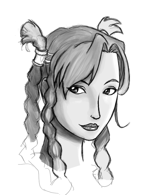
I don't really have much to say - It's a new high for my art, but I'm taking some time away from it so I can view it objectively later. Also, i have no idea how to draw long braids, so if anyone has any advice (beyond reference photos, which is probably where I'll pick up later), that would be good.

Also, it's the first image I've ever drawn that hasn't needed significant work when flipped horizontally. Usually my stuff has such a right handed slant it's not even funny.

Delzhand on

Posts

  • Options
    rtsrts Registered User regular
    edited March 2008
    Well it depends on what kind of look you are aiming for, but it seems you are a bit more on the cartoony side of things then I am. Personally, I would barely draw them at all if I had to take on such a task. In a portrait...which is what this basically is, the closest eye is just about always the focus. That lets you just throw most of the hair back into value, finding just a couple of areas here and there to make it clear that they are braids.

    rts on
    skype: rtschutter
  • Options
    DelzhandDelzhand Hard to miss. Registered User regular
    edited March 2008
    Portrait-copy.png

    More, this time with colors and better braids.

    I think, if anything, I should have moved her facial features up slightly. My horizontal centerline was too far down.

    Edit: Unspoilered.

    Delzhand on
  • Options
    DeeLockDeeLock Registered User regular
    edited March 2008
    The braids are now the focal point because they're so defined and bold while the rest of the piece is really simplified and flat.

    I'd take cakemix's advice.

    Right now there's just too many "styles" going on at once. Anime facial anatomy and features, rendered braids (but unrendered hair), and a flat design as the background...

    And why are you spoilering things in your own thread?

    DeeLock on
  • Options
    DelzhandDelzhand Hard to miss. Registered User regular
    edited March 2008
    You're definitely right. I'm not sure what "throwing it into value" means, honestly. I've never heard the phrase before. I've tried a few different things, do any of these look better? Left to right, I dropped the contrast and eliminated a lot of extra lines, completely erased all but the outlines, and just reduced the contrast (I think I like the middle one best). Something else I was thinking about was changing the leftmost and rightmost to primarily flat colors, and leaving the middle one as-is here. Any thoughts?

    Portrait-copy2.png

    Edit: I also think the rightmost braid is way too thick compared to the left ones, and should probably be moved forward more...

    Delzhand on
  • Options
    JandissJandiss Registered User regular
    edited March 2008
    It looks more liek the braids are hair extentions in the color version. they just for some reason are not meshing with the rest of the hair...
    honestly i like the first pic more before you put the defining lines in the braids...
    if i remember right your original pic has the braids done in almost the same style that they do the batman and robin cartoon from the 90s. My memory is dogcrap though.
    Regardless I think less is more in this pic. By focusing so much attention to the braids you are taking attention from the pic as a whole.

    Jandiss on
Sign In or Register to comment.