MustangArbiter of Unpopular OpinionsRegistered Userregular
edited June 2008
I'm sure I'm going to be pulled up that some women do have one knocker that's larger than the other....so I thought I'd better mention it........and now I'm going to be pulled up as a pig for calling them knockers.........yeah I've got no defence for that one.
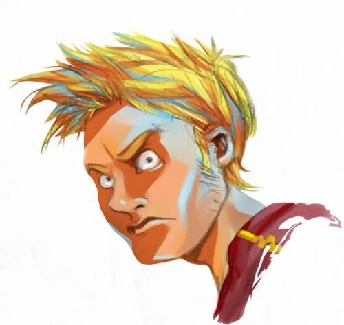
I like your colors, but there doesnt seem to be any rhyme or reason whatsoever as to where you choose to put them. That creates a disjointed feel, like the colors were painted on them rather than being cast be some particular light source.
I like your colors, but there doesnt seem to be any rhyme or reason whatsoever as to where you choose to put them. That creates a disjointed feel, like the colors were painted on them rather than being cast be some particular light source.
Yeah I'm definitely experimenting a bit, it works better on some cases than others for sure. Hopefully going apeshit in color now will benefit me when I go back to a more traditional approach and find a good balance.
I agree with Tam. Wierd lighting issues aside, I still like this alot -- sometimes you can break the rules and it still works, at least for the viewer (the portrait is bang on, though).
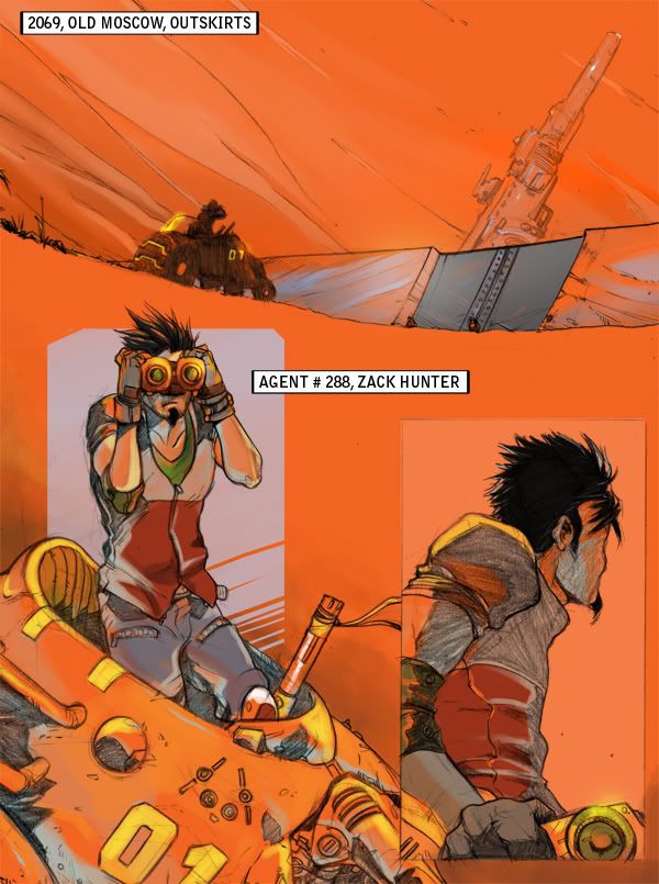
I can't really draw character/concept stuff so I'm envious. Keep it up!


Posts
and that's all I've got...good work!
eh, youre totally right! I hadn't noticed that before!
Thanks for the observation
Yeah I'm definitely experimenting a bit, it works better on some cases than others for sure. Hopefully going apeshit in color now will benefit me when I go back to a more traditional approach and find a good balance.
I can't really draw character/concept stuff so I'm envious. Keep it up!