As was foretold, we've added advertisements to the forums! If you have questions, or if you encounter any bugs, please visit this thread: https://forums.penny-arcade.com/discussion/240191/forum-advertisement-faq-and-reports-thread/
Options
Free Beer. Last page..
NakedZergling A more apocalyptic post apocalypse Portland OregonRegistered User regular
A more apocalyptic post apocalypse Portland OregonRegistered User regular
EDIT!!!
JUST DUMPING STUFF
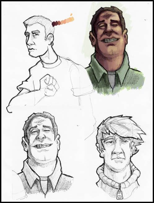
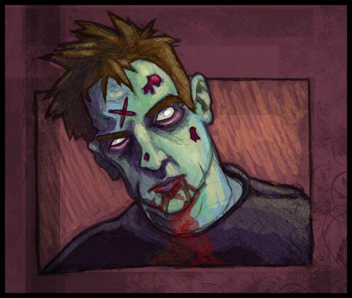
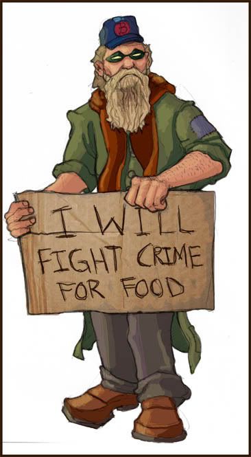
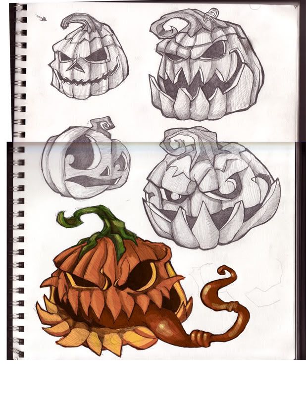
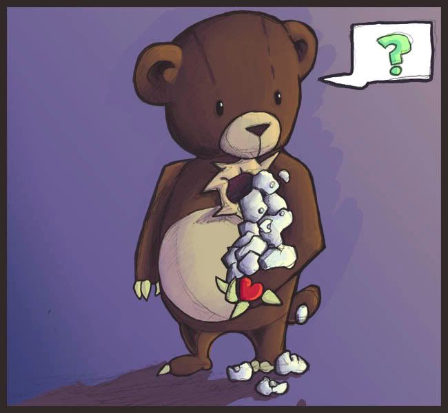
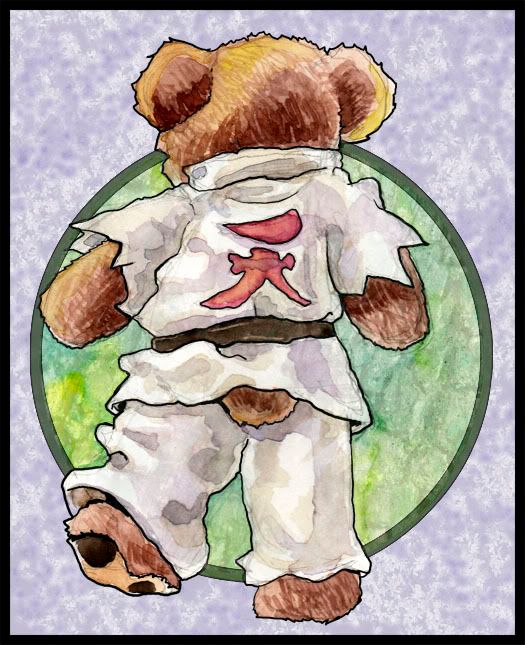
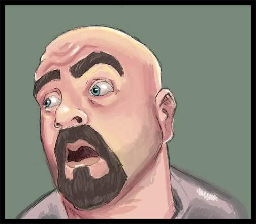
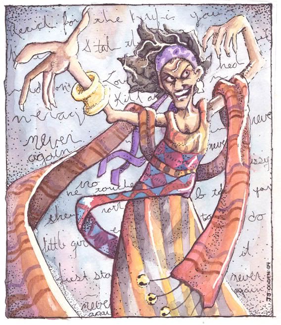
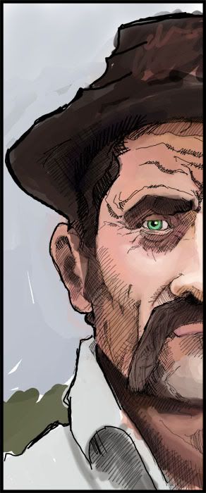
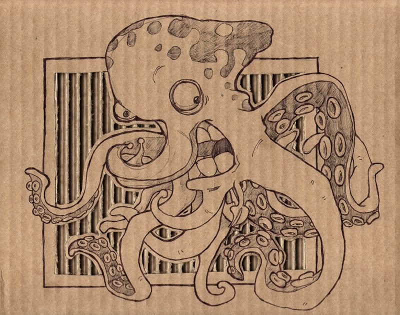
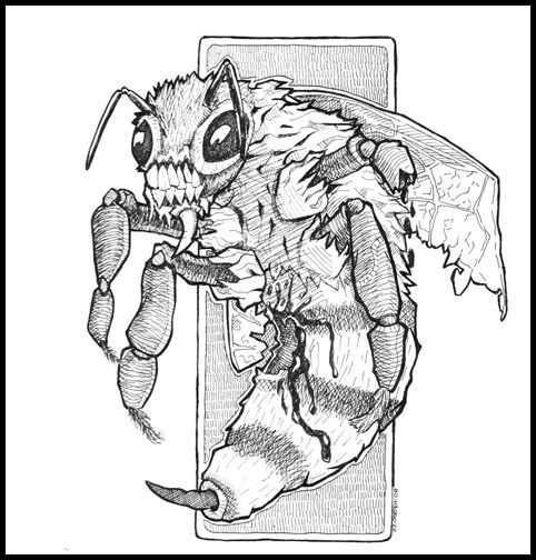
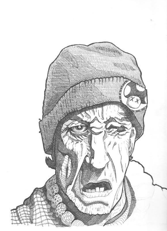
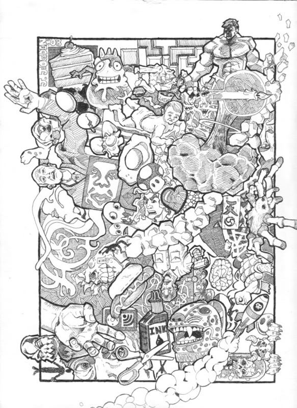
JUST DUMPING STUFF
NakedZergling on
+2
Posts
it looks pretty good for a portfolio for graphics or multimedia courses. what you applying for?
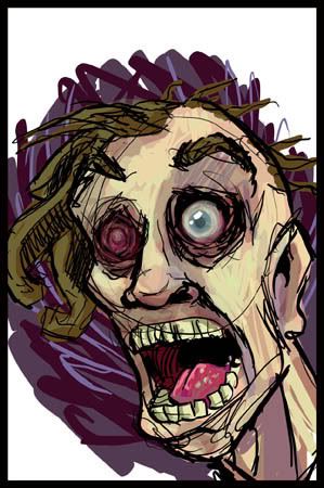
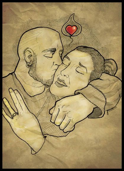
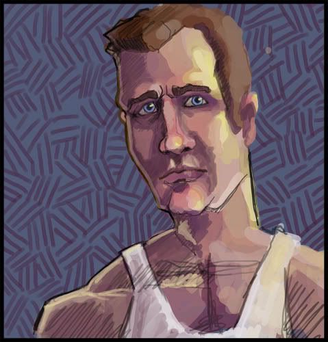
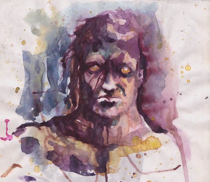
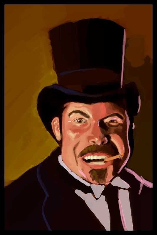
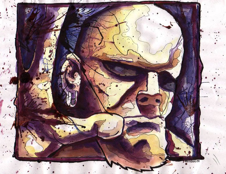
those messy portraits are also pretty cool.
I've been doing retail for the last 15 years and retail management for the last 4 of those. I'm really sick of it. I just want to do SOMETHING with art. I just feel i need a change, but like i said i'm lacking direction.
If you are talking about a portfolio to look for work with... well, I won't say you couldn't get work, but it would be few and far between and wouldn't get much money. I would suggest further education.
But yes i would like to be able to go back for more education, but i don't know if i can afford it.
Since none of these are really finished pictures persay the most immideate commercial application I can think of you in your case is you could get a few quick gigs doing cartoony type logos for local business types. If you like doing portraiture thats something to pursue.. Dosent really appear you do.
If your willing to invest a little money you can start shopping your stuff around to local publications trying to get spot illustrations. (Spot illustrations are usually just small little drawings of like.. a pumpking or a small head, thats dropped into a text block to supplement whats being written which is what most of thist stuff looks like) They usually pay anywhere between 100-700 dollars depending on the publications budget. By investing money im thinking mainly about postcards to send to them. The best way to go about getting their mailing information is to go to your local bookstore and browse the magazine rack and you can obtain most of the contact information from the masthead. A lot of it is really small hard to read text.
If you decide to go the spot illustration route you should attempt to educate yourself on what the standard art director - illustrator interactoin is.. ie thumbs sketches, blah blah if you dont already know all that shit. They dont just call you and say draw this then you turn in the final..
i quit after five years, I don't see how you can do 15.
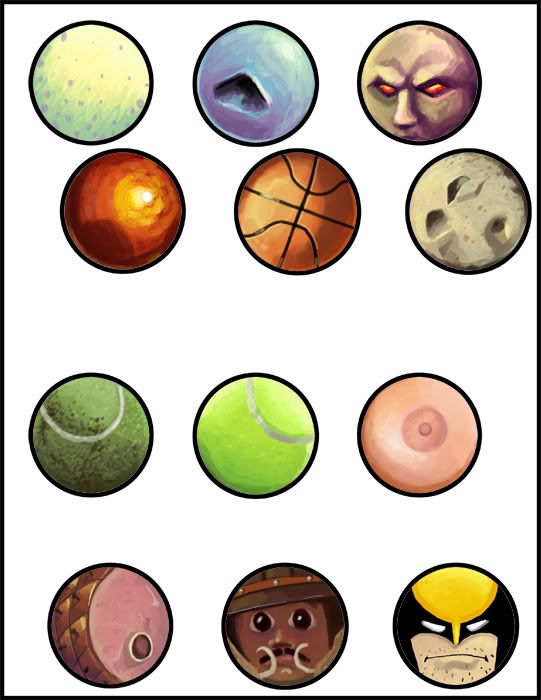
I assume these are for use with this:
which I totally had as a kid.
I would want an entire stack of the boob ones with different skin tones and nipple shapes.
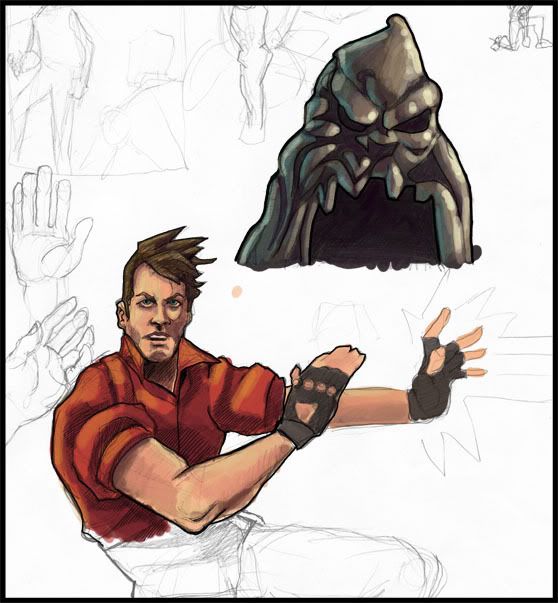
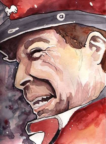
your M. Bison is ballin' as all get out, though. I think you'd do well designing pvc toys and the like.
That's the thread that got me started posting here, we should do another one of those.
mano- i have the same pain with my iphone. I submitted that bison to the street fighter tribute book, but they didn't accept it:( Are the pvc toys the designer toys like the munny and dunny things? If so i would freak out to design them.
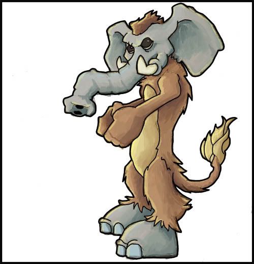
mustang- its actually for the conceptart.org creature of the week, but yeah it's the same idea. I totally agree, we should set that thread up again. That was really fun. My entry was the elephant/meercat near the top of the page.
My Portfolio Site
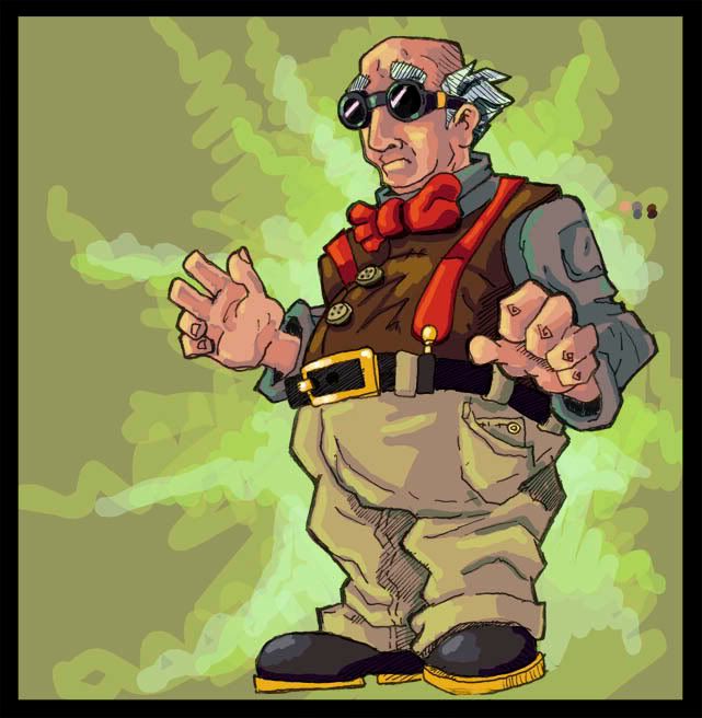
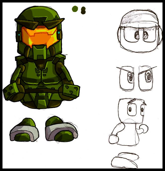
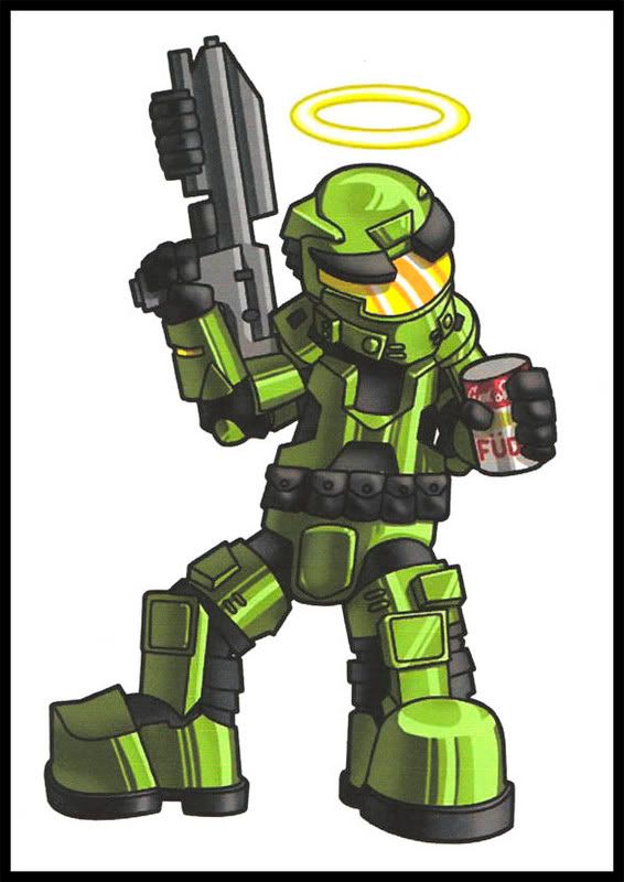
can anyone tell me whats the best way to do after effects like the scratches on his helmet
Also how do you wrap words around an object? like write something and make it into a circle?
Oh and the jetpack is behind his giant head. Yes i know he has a jet pack.
I'm not sure if this answers your question, but Photoshop has a "Warp Text" option when you have the text tool selected. It's at the top of the screen, in CS2 at least.
PSN: MaximasXXZ XBOX Live: SneakyMcSnipe
finally! second page! I loved coming in and seeing your art, but your first page was just way too image heavy for my netbook and chrome would stall everytime I opened it.
also i would love general feedback.
www.jayogdenart.com
whoops!
A few notes:
on the homepage, I think it would look nicer if you right justified your images so that they stay closer to the nav when they aren't wide enough.
Having the featured section seems a little redundant if you intend to basically have them displayed on the homepage.
Introducing the black on the about page is an interesting choice. I think bringing back any of the lighter colors you have on the site for the bg, and then having dark text would be more in line with the rest of your site.
I would re-order the links on the right. Looks like you did alphabetical, I would sort them in terms of proirity. Most people expect that out of links. Are your progress shots really more important than your watercolor works? By putting that link last, people are less likely to see it/look at it.
Your contact link links to the index.
Your typography seems a little medieval/ornate and doesn't quite match with the rest of your simple, clean, modern site. I'm not quite sure why you made 'the art' bigger than your name. Your name is your whole selling point! it should basically be the first thing you read on a portfolio site, and by making it smaller, it's not the first thing you read.
Otherwise, nice work man!
INSTAGRAM