As was foretold, we've added advertisements to the forums! If you have questions, or if you encounter any bugs, please visit this thread: https://forums.penny-arcade.com/discussion/240191/forum-advertisement-faq-and-reports-thread/
Options
It's my body, I'll dye if I want to (pic-heavy OP)
Charles Kinbote Registered User regular
Registered User regular
eff you societal stigmas
TATTOOS
those are some tattoos, but there are more out there
I myself am looking at getting one soon
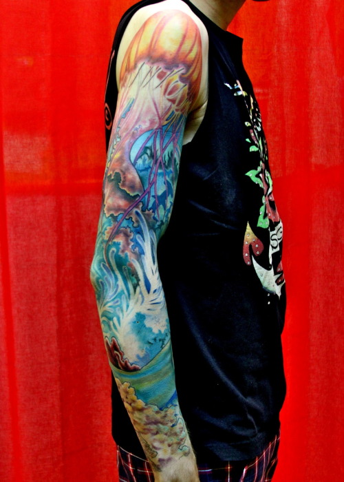
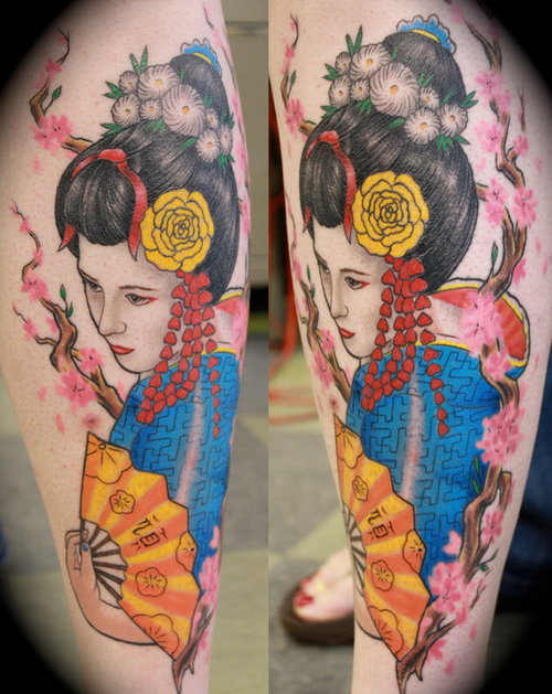
I want to get THIS (the one on the right)

under my COLLARBONE
tell me about your tattoos, your tattoo ideas, your tattoo detectives, it's not too late, to whip it
whip it good
oh also I expect a whole lot of hilariously bad tattoos to be posted but guys!! a lot of them have been posted before
it's fine if you guys want to do whatever, though
TATTOOS
those are some tattoos, but there are more out there
I myself am looking at getting one soon
I want to get THIS (the one on the right)
under my COLLARBONE
tell me about your tattoos, your tattoo ideas, your tattoo detectives, it's not too late, to whip it
whip it good
oh also I expect a whole lot of hilariously bad tattoos to be posted but guys!! a lot of them have been posted before
it's fine if you guys want to do whatever, though
Charles Kinbote on
0
This discussion has been closed.
Posts
OXFORD REFERENCING1
1FOR LIFE
except with the 1 in the proper place
we're going to be together foreverr~~~!
this is cool though
so
girl?
PARKER, YOU'RE FIRED! <-- My comic book podcast! Satan look here!
PARKER, YOU'RE FIRED! <-- My comic book podcast! Satan look here!
she just fucking loves studio ghibli films
PARKER, YOU'RE FIRED! <-- My comic book podcast! Satan look here!
I got this tattoo last year
someday
that's amazing
I am fully in support of any and all footnote humour
1. Oak Tree over my heart
2. Iron Fist logo on my shin
PARKER, YOU'RE FIRED! <-- My comic book podcast! Satan look here!
Second tattoo
like exactly the same shit but can be removed with something a bit easier than multiple lasers
because then fuck it who wouldnt get a tattoo
having to justify some stupid fucking picture as being of being significant lifelong importance is the only real concern
like that one in the op, where you might have to explain to anyone what it is
and then when they stare back all blank you gotta kinda shrug all 'i like fonts?'
here i come
callifornia
the o.c. owns
Avant garde
I like it
god these are so nerdy
but I really like the designs
He really wants to make a statement about the horrors of image hotlinking.
PARKER, YOU'RE FIRED! <-- My comic book podcast! Satan look here!
And he couldn't even have been that big of a fan if he got it wrong.
Man, the inking on that was ba-a-a-d
Either that or it's really really fresh
I met a lot of people like that when I was in the army and proved to them that they were indeed not the shit.
Rent: everything about it is terrible. That's what makes it great.
The input is wrong, the font is in no way streetfighter related, that's a black power fist, the + is just sorta squeezed in there.
It is perfection.
old photo, I got this one back in 2008
Edit: Nope, most sites say it is forward, down, down-right.
Better yet same thing but instead of a silhouette of a city it is a humpback whale.
It is certainly not.
http://www.eventhubs.com/guides/2008/oct/27/ryu-character-guide-super-street-fighter-2-turbo-hd-remix/