The new forums will be named Coin Return (based on the most recent vote)! You can check on the status and timeline of the transition to the new forums here.
The Guiding Principles and New Rules document is now in effect.
I've been lurking for about a year and learning as much as possible from you guys. I just started my new comic, HijiNKS Ensue, a couple of months ago. So far my biggest issues are with character design, and character consistency. Each time I do a new comic I want to change something about the characters' appearance (which I guess is OK when you are starting out), but I also find it difficult to keep their features and appearance constant from panel to panel. I assume that as I get more familiar with these characters it will become easier, but any tips would be greatly appreciated.
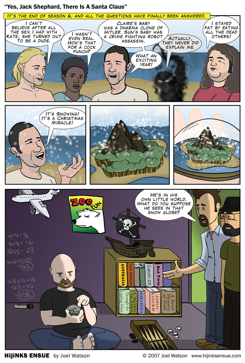
Here are a couple of my recent comics. The first one was part of a series about "LOST."
All I can really say is that it would be nice to see more sketches of the characters outside of the context of the comic.
Edit: It might be a good idea to post more (outside this thread, maybe outside AC too), otherwise it may look like you only signed up to plug your comic.
All I can really say is that it would be nice to see more sketches of the characters outside of the context of the comic.
Edit: It might be a good idea to post more, otherwise it may look like you only signed up to plug your comic.
Maybe thats what I'm missing. I only did a brief series of sketches before starting the first comic. I suppose doing more character analysis would help.
amateurhourOne day I'll be professionalhourThe woods somewhere in TennesseeRegistered Userregular
edited June 2007
I've been lurking on this forum a while now, and just recently registered. I've seen a lot of crappy webcomics come through. (which is why I won't post mine : ) ) I have to say though man, that your comic is one of the best I've seen on this board in a while. Original looking characters, good likeness of the ones you are doing a parody of, and f***ing great dialogue. You definately shouldn't be hearing the usual "it's too Gabe-Like" junk on this one. Good work man. No real crits here... more shadows maybe.... and more cowbell..
All I can really say is that it would be nice to see more sketches of the characters outside of the context of the comic.
Edit: It might be a good idea to post more (outside this thread, maybe outside AC too), otherwise it may look like you only signed up to plug your comic.
Duly noted. While this is my first post, and it IS about my comic, I really just want some feedback. When you show these things to your friends, all you get is "That rocks! Awesome." Nothing too helpful about that other than a quick ego boost.
I've been lurking on this forum a while now, and just recently registered. I've seen a lot of crappy webcomics come through. (which is why I won't post mine : ) ) I have to say though man, that your comic is one of the best I've seen on this board in a while. Original looking characters, good likeness of the ones you are doing a parody of, and f***ing great dialogue. You definately shouldn't be hearing the usual "it's too Gabe-Like" junk on this one. Good work man. No real crits here... more shadows maybe.... and more cowbell..
Thanks! I really struggled with the idea of shadows and shading, etc before opting out pretty much entirely. The only reason was time constraints. I am fighting to get one of these out a week (more like a week and half) so extra stuff like shadows and depth were the first corner to be cut.
I just learned a new coloring trick that saved me about 2 hours on the most recent one (posting later today), so as my style evolves I will try to work in some more graphic detail.
NakedZerglingA more apocalyptic post apocalypse Portland OregonRegistered Userregular
edited June 2007
yet another PA rip off. COME UP WITH YOUR OWN STYLE instead of just wanting to be gab...er...waaa? oh shit wait. sorry sorry. so used to saying that.
i really dig it man. a lot. i really liked the lost one.
keep it up
yet another PA rip off. COME UP WITH YOUR OWN STYLE instead of just wanting to be gab...er...waaa? oh shit wait. sorry sorry. so used to saying that.
i really dig it man. a lot. i really liked the lost one.
keep it up
Ok, you seriously had me going there. You're used to saying it and Im used to reading it.
I'd also try and find a more readable font and make better use of your bubble space. If it's easier for me to read posts than your words you need to change something.
Needs work in quite a few places, but you have potential to get something damn good together.
One thing I strongly recommend you work on is perspective. I really like that you're trying to have your characters occupy a 3D space, because a lot of run-of-the-mill starter webcomics don't bother with that at all, but the space you're creating needs some work. That last panel in the first comic looks pretty off because in real life, perspective doesn't work like that. When you look at a room, you NEVER see a bunch of perfectly horizontal and vertical lines connected by angled lines that are all perfectly parallel to each other. If you want to create a believable and dynamic space for your characters to inhabit, then you're going to have to learn how 3D spaces really look.
I'd also try and find a more readable font and make better use of your bubble space. If it's easier for me to read posts than your words you need to change something.
I agree. I started with comic sans (dodges rocks) then went to Blambot to search for something better. I am using Crimefighter BB (?) right now. Any suggestions? Of the free ones I found this was the most readable but I have never been happy with it.
Needs work in quite a few places, but you have potential to get something damn good together.
One thing I strongly recommend you work on is perspective. I really like that you're trying to have your characters occupy a 3D space, because a lot of run-of-the-mill starter webcomics don't bother with that at all, but the space you're creating needs some work. That last panel in the first comic looks pretty off because in real life, perspective doesn't work like that. When you look at a room, you NEVER see a bunch of perfectly horizontal and vertical lines connected by angled lines that are all perfectly parallel to each other. If you want to create a believable and dynamic space for your characters to inhabit, then you're going to have to learn how 3D spaces really look.
Very true! I am a 3D space slacker. I've found the size of the panels (after shrinking to 760) to be too small to create the spaces that I want to, So I've been rushing through them. I think its also because I draw the characters first, then go back and do the backgrounds. Maybe some better planning would pay off.
I like your drawing style alot. What program do you use to draw? I use Flash and it sucks monkeys, cuz everything thats done in flash.... looks like its done in flash.... no matter what. Even if you have an original style, that varying lineweight crap ruins it. But, I'm cheap and can't afford photoshop at the moment.... what the hell am i ranting for in your post? Anyways, I like the art, the colors, and the stories. And the Johnny Depp "I'm not that high" thing was great.
the_monarch23 on
"Gott in himmel! Fritz, vee haff named our car after ein lady-garten."
~Jeremy Clarkson
The art could use a bit of work but certainly isn't bad. And the jokes are funny and original so it makes up for it.
Also, from your site:
We watch Buffy, Battlestar, and Lost in groups just to hear each others quips and comments. Its like homemade DVD commentary. We’re silent during Firefly. Some things are still sacred.
I like your drawing style alot. What program do you use to draw? I use Flash and it sucks monkeys, cuz everything thats done in flash.... looks like its done in flash.... no matter what. Even if you have an original style, that varying lineweight crap ruins it. But, I'm cheap and can't afford photoshop at the moment.... what the hell am i ranting for in your post? Anyways, I like the art, the colors, and the stories. And the Johnny Depp "I'm not that high" thing was great.
#1 Release the butterflies! ................Okay, whose job was it to feed the butterflies?
#2 Photoshop plain and simple. I do the rough sketch on the bottom layer in photoshop. I was scanning pencil drawings but I erase A LOT and PS made that much easier to deal with. I ink over that with a Wacom Intuos tablet. Then I color on a layer below the inks. My final PSD files are about 50mb with 30 - 40 layers. I use a lot of Shape layers for walls and carpet and such.
Im sure there are better techniques, but this is was I've figured out from tutorials and trial and error.
I really like how you pulled off the Johnny Depp and Keith Richards strip, a lot.
The only criticism I have is that on the first two panels of the Pirates strip, their poses look really weird. Also, considering the amount of detail you put into the comic, your backgrounds are really dull.
bread of wonder on
Long distance runner, what you standin' there for?
It seems like all of the comics can be condensed down to 3 or even 2 panels and still have the same effect without all the "forced funny" at the end. And it looks like you're trying to improve the art style so I'll save you that blurb.
I did like the "Hey, internets! Youtube a podcast or something."
In three words, I like it. In five words, I like it very much. In 35 words, I like it very much, but as Stealth said, it can be condensed a bit better. There's no THS, lots of different angles, and over time I'm sure your technique will improve on its own.
As you make more comics, make sure to enhance the personalities of your characters. This will lead to even more plots and interesting interactions.
I really like how you pulled off the Johnny Depp and Keith Richards strip, a lot.
The only criticism I have is that on the first two panels of the Pirates strip, their poses look really weird. Also, considering the amount of detail you put into the comic, your backgrounds are really dull.
Yeah I was trying to make it look like they were contorting all over the place playing Wii Sports. As for the backgrounds, its more of a time (lasziness) issue. By the time I get to them I am ready to move on. Im also worried that any detail I do in the BG will get lost once I shrink the image. Thanks for replying!
It seems like all of the comics can be condensed down to 3 or even 2 panels and still have the same effect without all the "forced funny" at the end. And it looks like you're trying to improve the art style so I'll save you that blurb.
I did like the "Hey, internets! Youtube a podcast or something."
I would love to condense these. I feel like I am trying to go "too big" and creating more work for myself. When I come up with the story they seem to lend themselves to this format. I'd rather do smaller strips more often but I dont want to sacrifice any of the elements that I think further the idea or joke. I grew up with Calvin and Hobbes. Bill Watterson used to add a throw away panel to the beginning and end of each strip so the papers that gave him less space could still run the comic. I probably have a few throw away panels too. Thanks!
In three words, I like it. In five words, I like it very much. In 35 words, I like it very much, but as Stealth said, it can be condensed a bit better. There's no THS, lots of different angles, and over time I'm sure your technique will improve on its own.
As you make more comics, make sure to enhance the personalities of your characters. This will lead to even more plots and interesting interactions.
Best of luck to you!
THS? True Hollywood story? Fill me in.
I'm going to work on the condensation. Thanks for your input!
Sorry. THS in the comic art community is "Talking Head Syndrome" which is when two or more consecutive panels have been copy-pasted and changed slightly so it looks like the characters haven't moved. It's a shortcut not uncommon in PA comics, but avoiding it really enhances the quality of any well-drawn comic.
ie, THS is bad, in my opinion, and you dodged it nicely.
Gotcha! Makes sense now. I like action and movement in comics, so even if its just two dudes on a couch, I like to swing the "camera" around if I can.
I always feel uncomfortable when there's a lot of cursing since comic #1. I mean, i tolerate it after I've grown to like the characters... but who knows, that's just me. Still, I'll try to elaborate a bit on my point:
-Excessive use of grammar crutches like the barrage of cusses you used is indicative of poor vocabulary. I mean, you can't find a better word? I'm pretty sure that if you look up a dictionary, you'll find a funnier word.
-To me, cussing is a bit like design: Less is more. These words kinda loose their impact and their funny after you've said them 10 times in a single speech baloon.
Honestly, I find cursing extremely humorous. Theres something about a cacophonous string of expletives that makes music to my ears. Lots of nice, percussive consonant sounds. It's not for everyone, but I write these strips like the people represented in them actually talk. Every third word is "fuck." Oddly enough every 7th word is "petticoat"
I think the point is that a word-for-word transcription isn't good if this is for the masses. Creative rewriting is allowed. :P
Cursing is a tricky element to incorporate properly. Pulp Fiction won an Oscar for best writing, and was overflowing with strings of swears. There's a place. There's a market. Of course, that was a film about gangsters, drug dealers, and crooks.
One key element to remember, though, is that "actual talk" makes for bad writing. I dare you to listen to the dialogue you exchange throughout an entire day and tell me it's entertaining. Half of speech is full of repetition and filler, often for clarity and timing, as people aren't sitting on witty remarks to every situation. But your liberties as a writer allow you to condense and amplify the very best elements. I think the point trying to be made is that the swears should be selected not because they exist, but because they amply the speech.
Example: When the guys are swinging around the Wiimotes and having what appears to be casual conversation, the use of swears makes them appear crude. However, at the end of that comic, it seems appropriate for the director to be swearing about Keith Richards wandering onto the set as a pirate. He is in a state of disbelief and shock, thus his response needs to be highlighted as such.
The bottom line is we're talking about a stylistic choice. At this stage there are no obvious violations or problems, but it's something to consider are you continue to flesh out the characters and your art style. These people may be vulgar, but remember, as you define characters by those traits they have to be consistent. To give a Penny Arcade example: the strip where Gabe and Tycho visit a school and Gabe struggles to not draw a penis. His past vulgarity was highlighted in an inappropriate setting for comedic effect.
In short, don't feel like you must abandon your love of expletives. Instead, simply find a way to weave them into the tapestry of the characters without having it define them.
And it is worth noting the only reason I took the time to make this post is because there's quite a bit of potential in your comic. Excellent start. You'll find a following if you continue to develop.
I see your point. Thanks for taking the time to illustrate it and provide examples. I definitely dont want to be written off as "another cursing comic." I will take this advice on the next few strips and see what the results are. I was done with today's comic before I read this. There's less cursing (link) but i see how I could have used it to greater effect if it related more to the characters emotional state at the time. Good advice.
Wow, this one was actually really funny! Characters are well drawn, nice linework. Backgrounds need work though, alot of them look a bit MS Paint-ish if you know what I mean. But seriously, really nice work man, especially the writing.
Backgrounds are tough. I dont want to distract from the characters and the dialog usually ends up covering up a significant portion of it. Let's say they are inside. I suppose I could add photos on the wall, lamps, props ,etc. Maybe some open hallways or doorways into other rooms. Its certainly worth a try. Thanks for the kind feedback!
BroloBroseidonLord of the BroceanRegistered Userregular
edited June 2007
You really need to work on the shading for your characters. Your first strip has some nice looking line drawings, some decent flat colours but some horrible shadow in that last panel. They ignore the shape and contours of the characters faces, and they fade in as if they were, well, drawn in with a straight downwards stroke of a photoshop brush, with hardness set to "0%". For lighting situations like that you'd want to create a layer of shadows on top of your flats (but under your lines) and then make sure they conform to the anatomy of the figure; on a human face lit from the side you'll see the cheekbones, forehead and chin retain some lighting, but the nose, lips and eye sockets will either be casting shadows or be covered in shadow, depending on the direction of the light.
I'd actually stay away from using soft brushes in PS for shading, particularly anything close to dodge/burn. Same goes to applying layer effects like "glow". The motion lines for when they're swinging the wiimotes use similar special effects, but the most obvious is Keith Leger when his silhouette comes through the door. You only used it once, but anyone who's used photoshop before can spot it, because the effect is completely two-dimensional. This is the kind of stuff you have to paint in by hand.
Well you certainly pegged my techniques. Im really just trying to figure this stuff out as I go. The first comic is the first digital art i've ever done, so Im not really well versed in advanced shading methods. I definitely want to learn as I go. Light sources are a problem for me. I've thought about buying a figure model and shining a desk lamp on it. Thanks for the advice.
Posts
All I can really say is that it would be nice to see more sketches of the characters outside of the context of the comic.
Edit: It might be a good idea to post more (outside this thread, maybe outside AC too), otherwise it may look like you only signed up to plug your comic.
geek comic
www.hijinksensue.com
[SIGPIC][/SIGPIC]
geek comic
www.hijinksensue.com
[SIGPIC][/SIGPIC]
I just learned a new coloring trick that saved me about 2 hours on the most recent one (posting later today), so as my style evolves I will try to work in some more graphic detail.
geek comic
www.hijinksensue.com
[SIGPIC][/SIGPIC]
...not that anyone cares...:...:
i really dig it man. a lot. i really liked the lost one.
keep it up
I appreciate the feedback.
geek comic
www.hijinksensue.com
[SIGPIC][/SIGPIC]
geek comic
www.hijinksensue.com
[SIGPIC][/SIGPIC]
I'd also try and find a more readable font and make better use of your bubble space. If it's easier for me to read posts than your words you need to change something.
One thing I strongly recommend you work on is perspective. I really like that you're trying to have your characters occupy a 3D space, because a lot of run-of-the-mill starter webcomics don't bother with that at all, but the space you're creating needs some work. That last panel in the first comic looks pretty off because in real life, perspective doesn't work like that. When you look at a room, you NEVER see a bunch of perfectly horizontal and vertical lines connected by angled lines that are all perfectly parallel to each other. If you want to create a believable and dynamic space for your characters to inhabit, then you're going to have to learn how 3D spaces really look.
geek comic
www.hijinksensue.com
[SIGPIC][/SIGPIC]
Thanks!
geek comic
www.hijinksensue.com
[SIGPIC][/SIGPIC]
geek comic
www.hijinksensue.com
[SIGPIC][/SIGPIC]
~Jeremy Clarkson
Also, from your site:
So, you win in my books!
#2 Photoshop plain and simple. I do the rough sketch on the bottom layer in photoshop. I was scanning pencil drawings but I erase A LOT and PS made that much easier to deal with. I ink over that with a Wacom Intuos tablet. Then I color on a layer below the inks. My final PSD files are about 50mb with 30 - 40 layers. I use a lot of Shape layers for walls and carpet and such.
Im sure there are better techniques, but this is was I've figured out from tutorials and trial and error.
geek comic
www.hijinksensue.com
[SIGPIC][/SIGPIC]
So I win in your book as in BOOKS, or book as in Afro-Ponytailed Space Preacher?
geek comic
www.hijinksensue.com
[SIGPIC][/SIGPIC]
The only criticism I have is that on the first two panels of the Pirates strip, their poses look really weird. Also, considering the amount of detail you put into the comic, your backgrounds are really dull.
I did like the "Hey, internets! Youtube a podcast or something."
As you make more comics, make sure to enhance the personalities of your characters. This will lead to even more plots and interesting interactions.
Best of luck to you!
geek comic
www.hijinksensue.com
[SIGPIC][/SIGPIC]
geek comic
www.hijinksensue.com
[SIGPIC][/SIGPIC]
I'm going to work on the condensation. Thanks for your input!
geek comic
www.hijinksensue.com
[SIGPIC][/SIGPIC]
Sorry. THS in the comic art community is "Talking Head Syndrome" which is when two or more consecutive panels have been copy-pasted and changed slightly so it looks like the characters haven't moved. It's a shortcut not uncommon in PA comics, but avoiding it really enhances the quality of any well-drawn comic.
ie, THS is bad, in my opinion, and you dodged it nicely.
geek comic
www.hijinksensue.com
[SIGPIC][/SIGPIC]
-Excessive use of grammar crutches like the barrage of cusses you used is indicative of poor vocabulary. I mean, you can't find a better word? I'm pretty sure that if you look up a dictionary, you'll find a funnier word.
-To me, cussing is a bit like design: Less is more. These words kinda loose their impact and their funny after you've said them 10 times in a single speech baloon.
geek comic
www.hijinksensue.com
[SIGPIC][/SIGPIC]
I think the point is that a word-for-word transcription isn't good if this is for the masses. Creative rewriting is allowed. :P
Cursing is a tricky element to incorporate properly. Pulp Fiction won an Oscar for best writing, and was overflowing with strings of swears. There's a place. There's a market. Of course, that was a film about gangsters, drug dealers, and crooks.
One key element to remember, though, is that "actual talk" makes for bad writing. I dare you to listen to the dialogue you exchange throughout an entire day and tell me it's entertaining. Half of speech is full of repetition and filler, often for clarity and timing, as people aren't sitting on witty remarks to every situation. But your liberties as a writer allow you to condense and amplify the very best elements. I think the point trying to be made is that the swears should be selected not because they exist, but because they amply the speech.
Example: When the guys are swinging around the Wiimotes and having what appears to be casual conversation, the use of swears makes them appear crude. However, at the end of that comic, it seems appropriate for the director to be swearing about Keith Richards wandering onto the set as a pirate. He is in a state of disbelief and shock, thus his response needs to be highlighted as such.
The bottom line is we're talking about a stylistic choice. At this stage there are no obvious violations or problems, but it's something to consider are you continue to flesh out the characters and your art style. These people may be vulgar, but remember, as you define characters by those traits they have to be consistent. To give a Penny Arcade example: the strip where Gabe and Tycho visit a school and Gabe struggles to not draw a penis. His past vulgarity was highlighted in an inappropriate setting for comedic effect.
In short, don't feel like you must abandon your love of expletives. Instead, simply find a way to weave them into the tapestry of the characters without having it define them.
And it is worth noting the only reason I took the time to make this post is because there's quite a bit of potential in your comic. Excellent start. You'll find a following if you continue to develop.
Warframe: TheBaconDwarf
geek comic
www.hijinksensue.com
[SIGPIC][/SIGPIC]
geek comic
www.hijinksensue.com
[SIGPIC][/SIGPIC]
I'd actually stay away from using soft brushes in PS for shading, particularly anything close to dodge/burn. Same goes to applying layer effects like "glow". The motion lines for when they're swinging the wiimotes use similar special effects, but the most obvious is Keith Leger when his silhouette comes through the door. You only used it once, but anyone who's used photoshop before can spot it, because the effect is completely two-dimensional. This is the kind of stuff you have to paint in by hand.
geek comic
www.hijinksensue.com
[SIGPIC][/SIGPIC]
geek comic
www.hijinksensue.com
[SIGPIC][/SIGPIC]